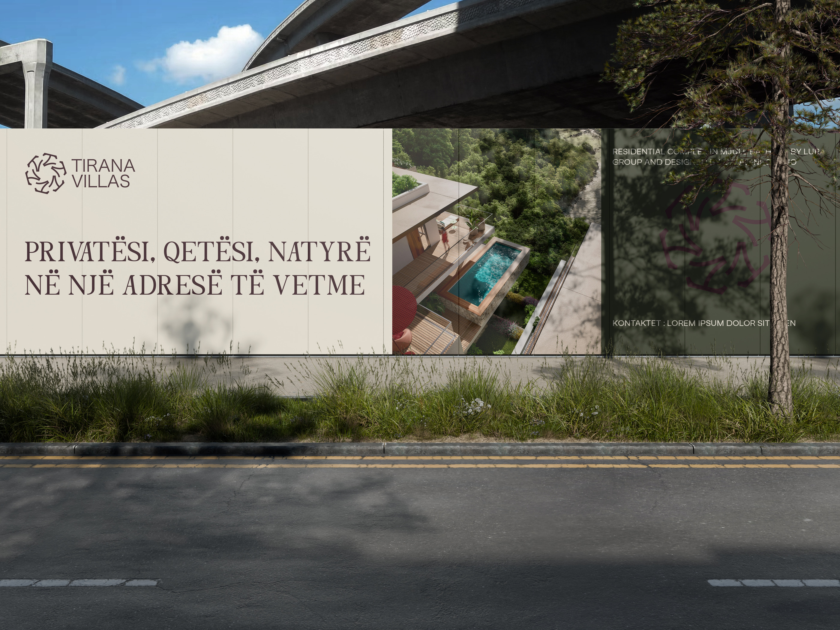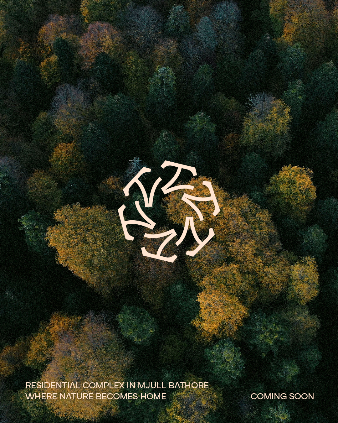
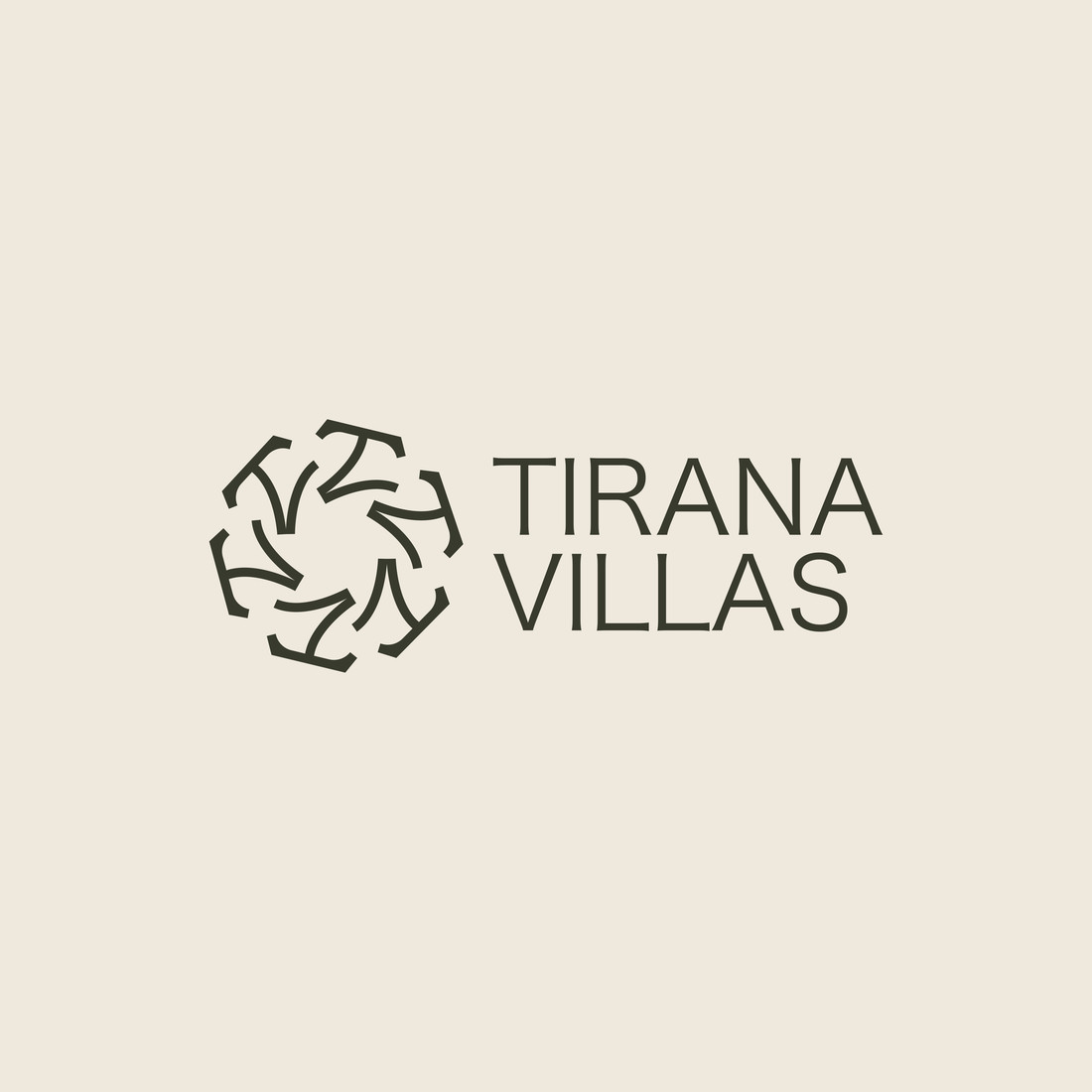
Tirana Villas is a new living concept that brings a rare standard to Tirana’s residential market. Set between nature and away from the rhythm of the city, it is designed for those looking for more than a home: space, calm and quality of life. We created a refined identity that turns this experience of living into a clear, elegant brand.
Services
Brand Identity · Logo Design · Color & Typography System · Brand Applications · Social Media Design
Where life rises above the city.
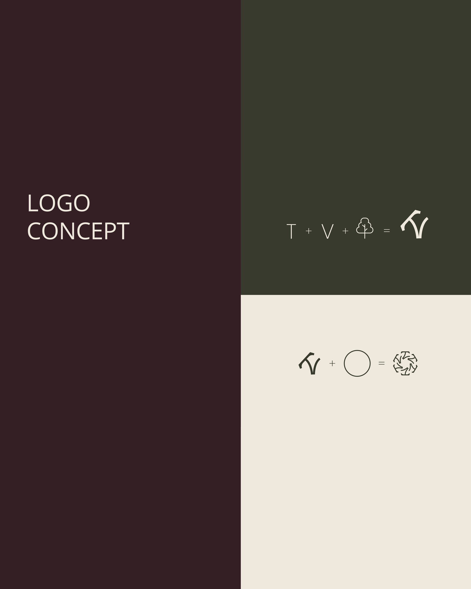
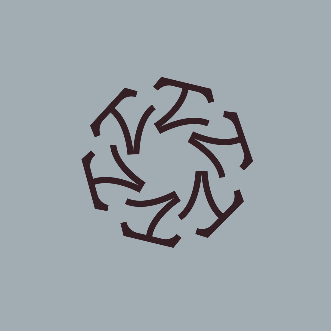
The logo is built on a minimal, refined approach, bringing the initials T and V together in an organic, balanced form. The final circular symbol, made of repeated elements in rotation, suggests continuity, community and harmony with nature.
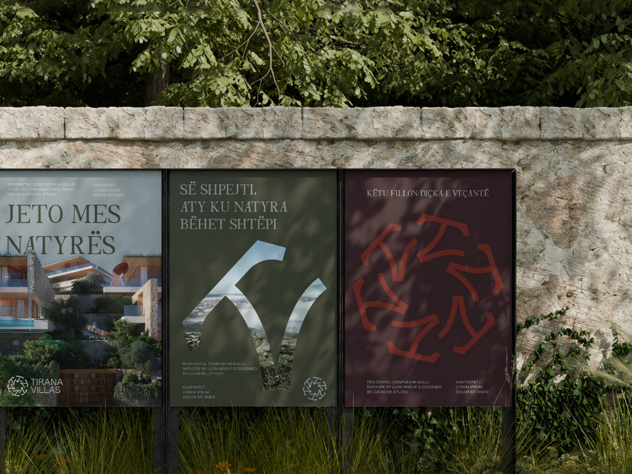
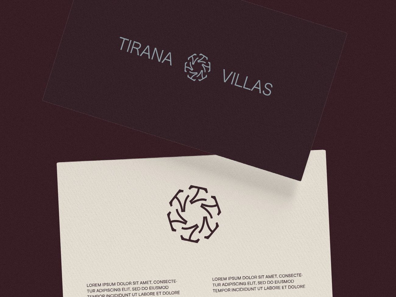
A palette of soft beige, light blue grey, deep olive green, earthy red and deep burgundy, paired with The Foriene Serif and Guton, balances classic elegance with a modern approach across print, outdoor and social media.