Where strategy, aesthetics and storytelling come together.
↓ About us
About us
↓ Mission & vision
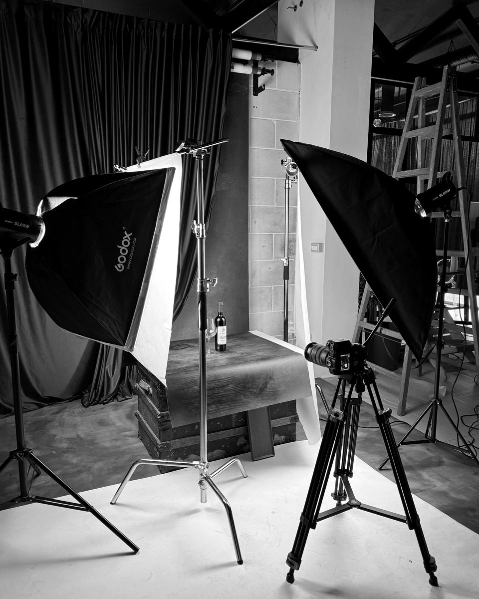
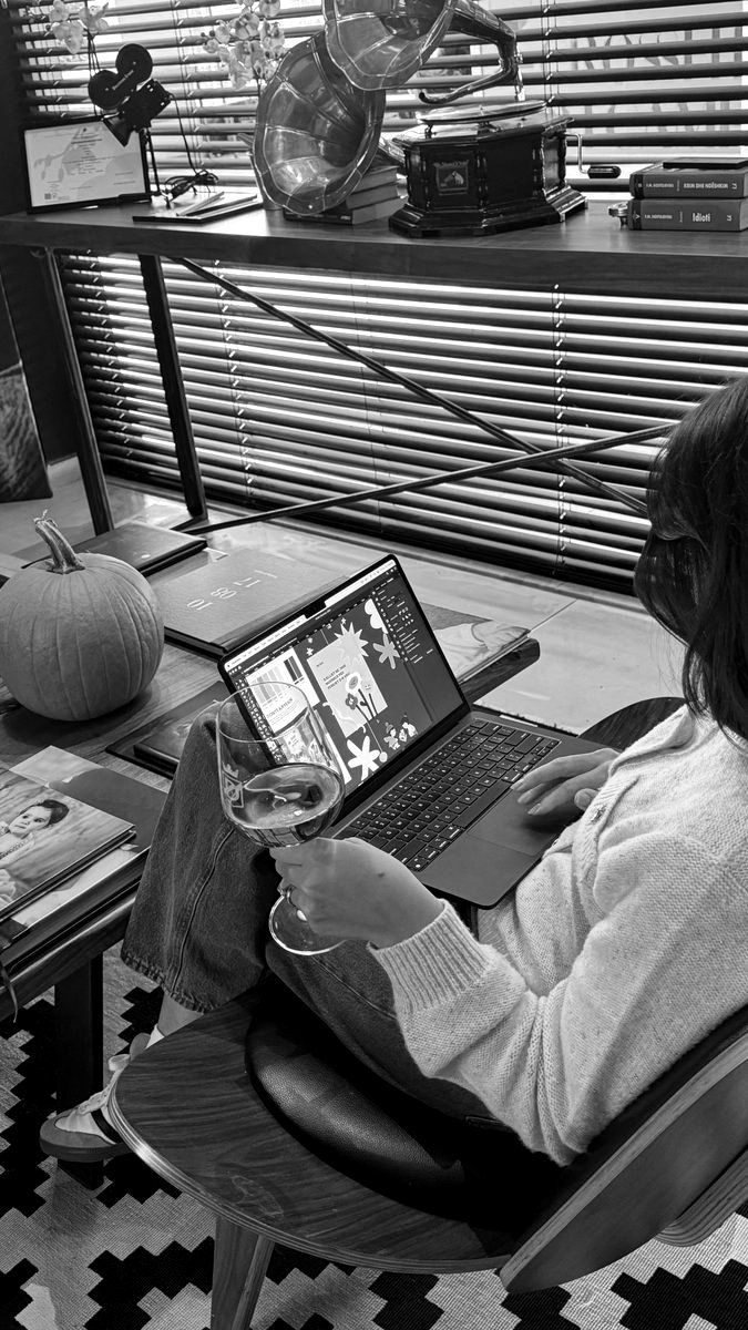
We are a strategic content and creative studio built around a strong belief in aesthetics, quality and purpose. Founded in 2021, Bloom Studios grew from a passion in photography into a multidisciplinary studio where visual storytelling, creative direction and digital strategy come together.
We partner with brands to create distinctive identities, meaningful content and digital experiences designed not only to look good, but to perform.
We're always drawn to ambitious ideas, new challenges and brands ready to grow.
Will yours be next?
Mission
To build digital presences that feel distinctive, relevant and impossible to overlook.
We combine strategy, creativity and high quality content to help brands communicate with clarity, connect with the right audience and grow with purpose.
Vision
To shape brands that stand out visually & strategically. We believe the strongest brands are built where storytelling, design and strategy meet.
Our vision is to create work that feels authentic, performs with purpose and builds lasting value beyond the feed.
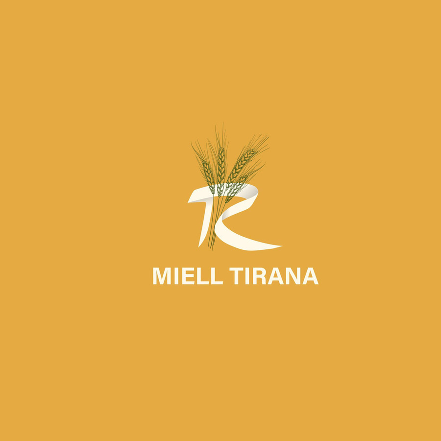
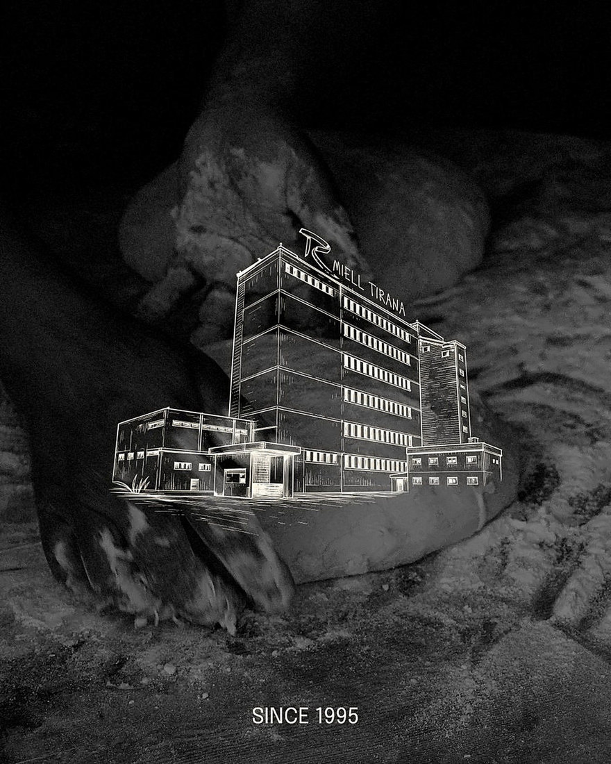
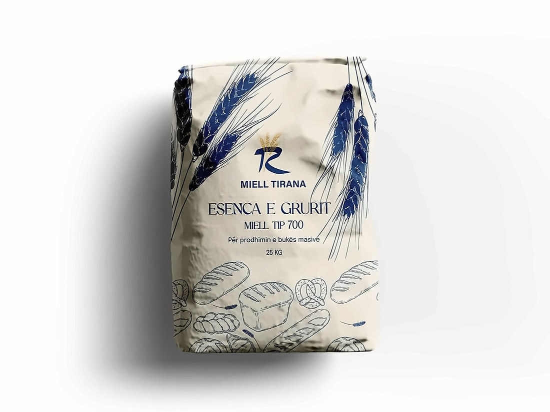
For Miell Tirana, we reimagined the identity of one of Albania's established flour producers, evolving it from a traditional image into a cleaner, more contemporary and professional brand. The rebrand reflects the company's growth and its focus on quality, reliability, technology and international standards.
Services
Rebranding · Creative Direction · Logo Design · Visual Identity · Typography & Color System · Illustration Direction · Packaging · Brand Applications
Miell Tirana
A new identity for a brand rooted in tradition and built for what comes next.
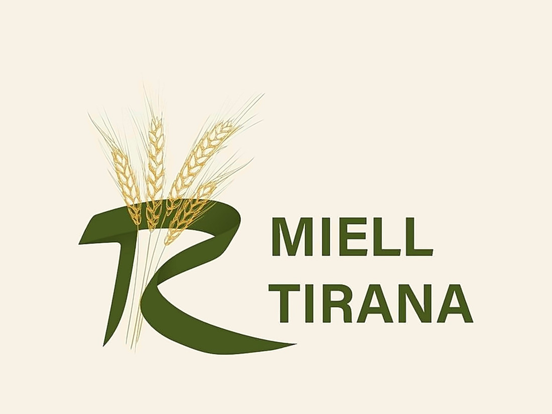
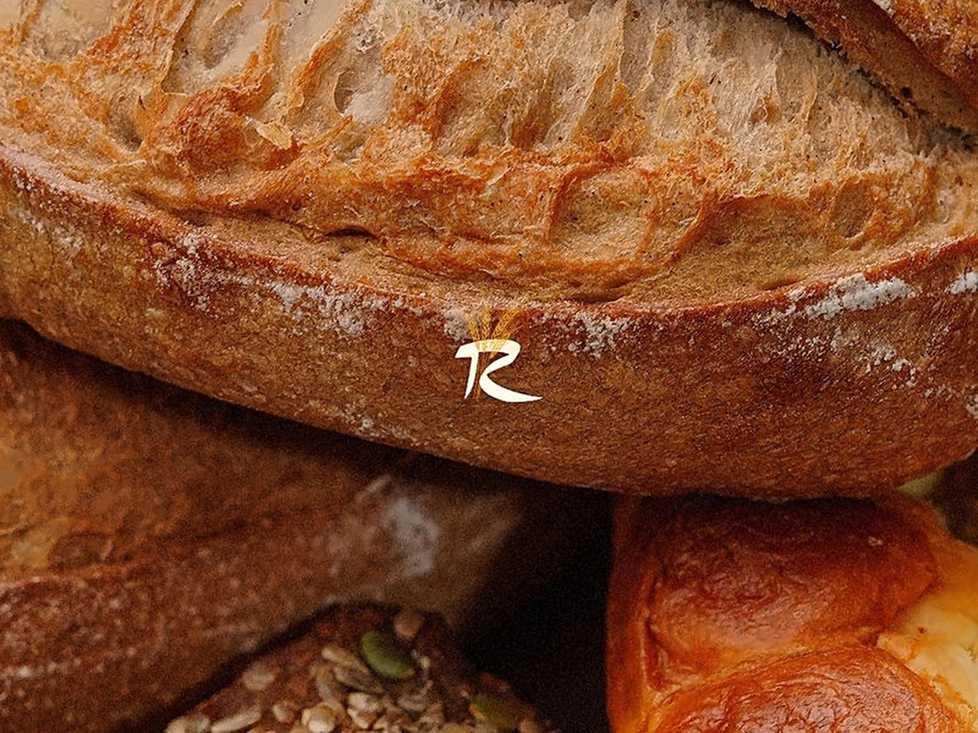
At the heart of the new identity is a distinctive symbol combining the letterform with wheat — connecting the brand directly to its product and heritage while giving it a stronger, more recognizable presence. An earthy palette of greens, wheat-inspired neutrals and warm golden tones reinforces the connection to grain and origin.
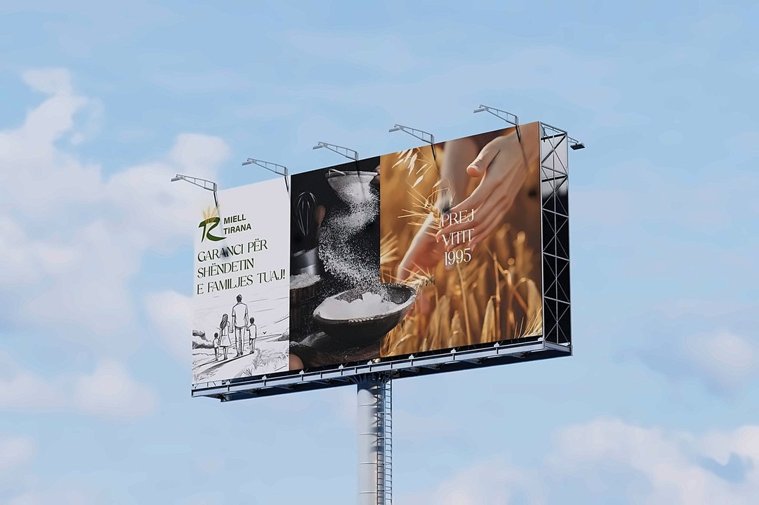
The system extends beyond the logo into typography, illustration, packaging, corporate materials and large-scale applications, creating a flexible identity that bridges Miell Tirana's heritage with a more modern future.
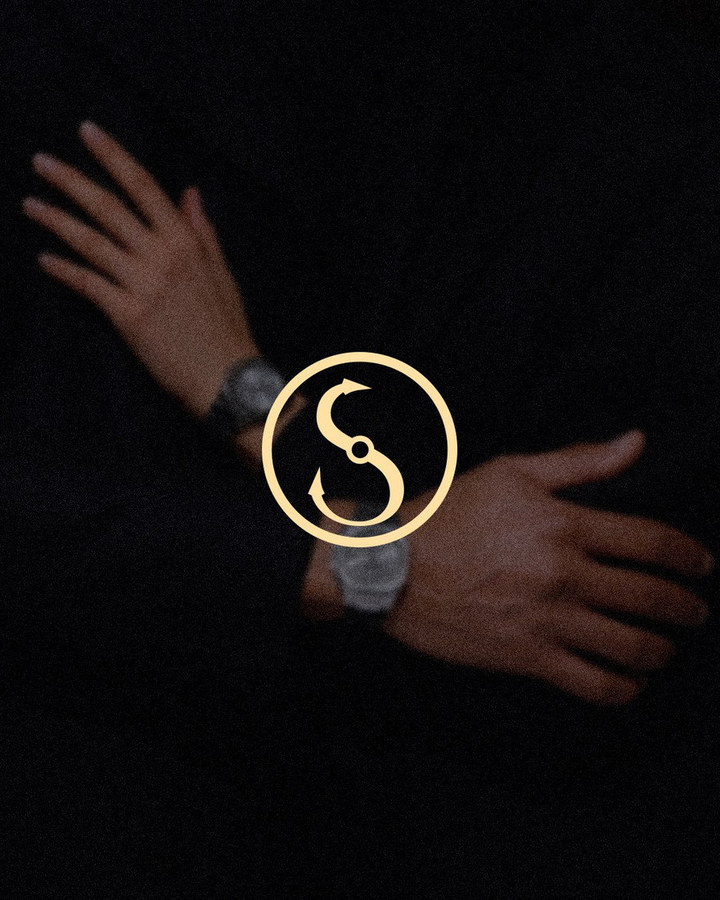
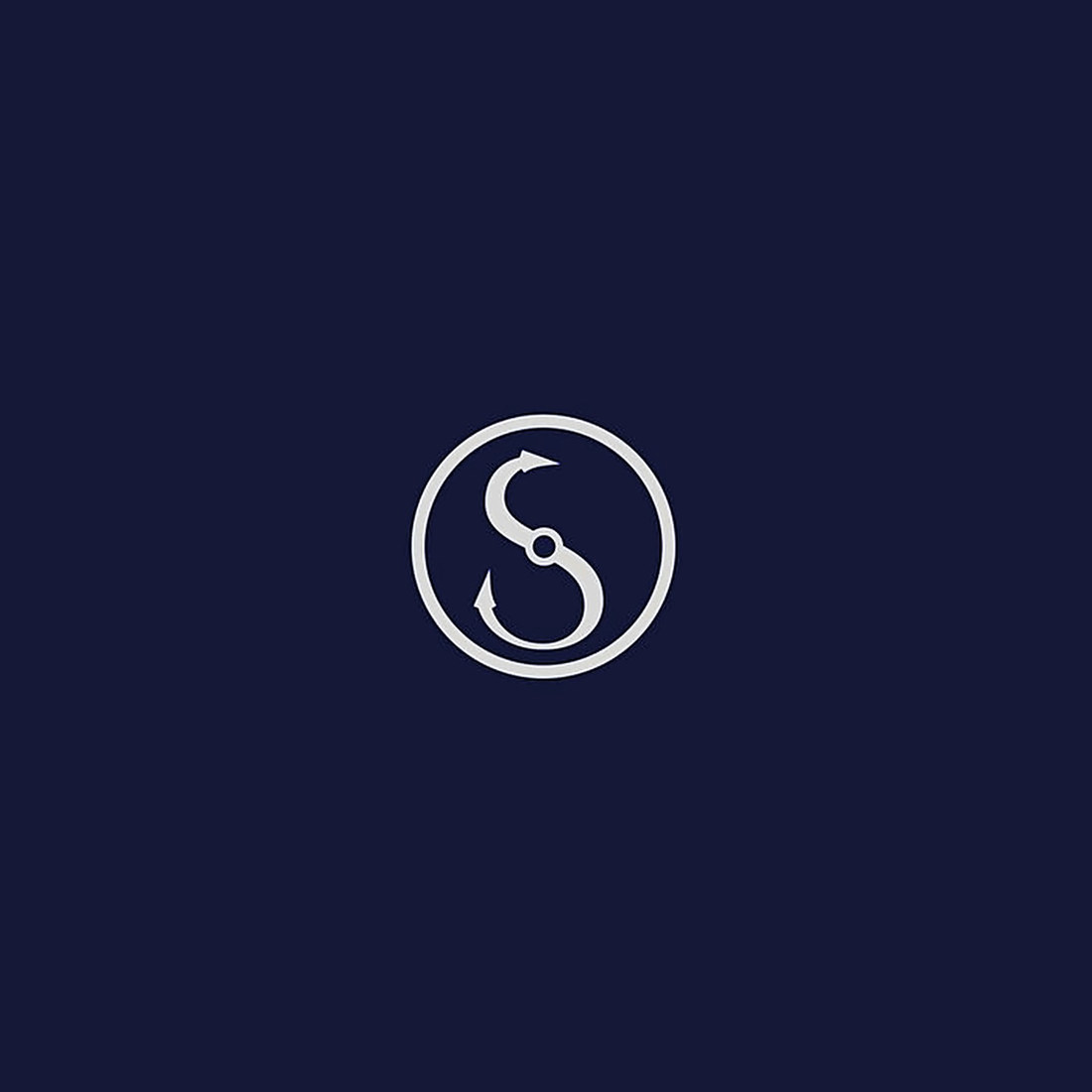
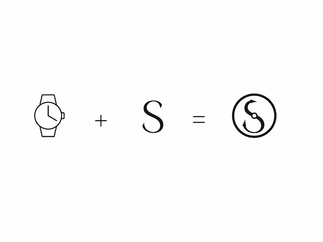
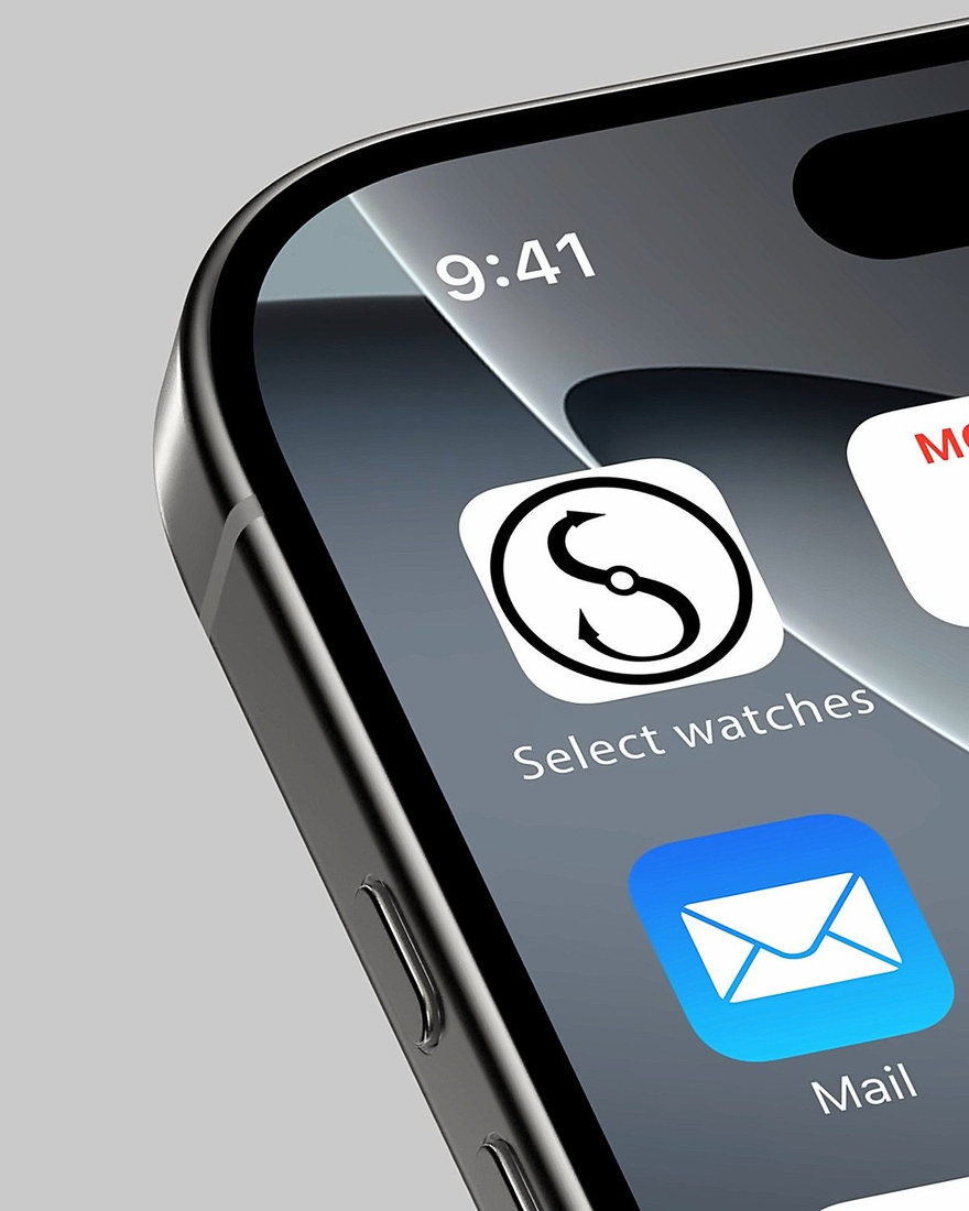
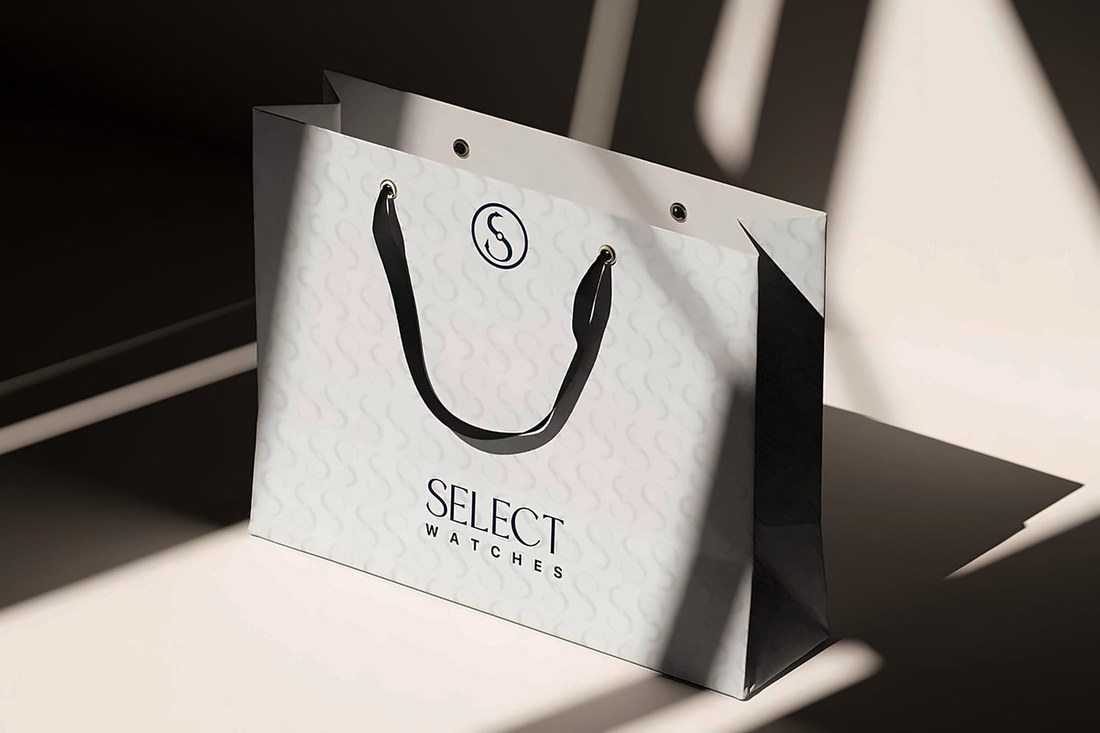
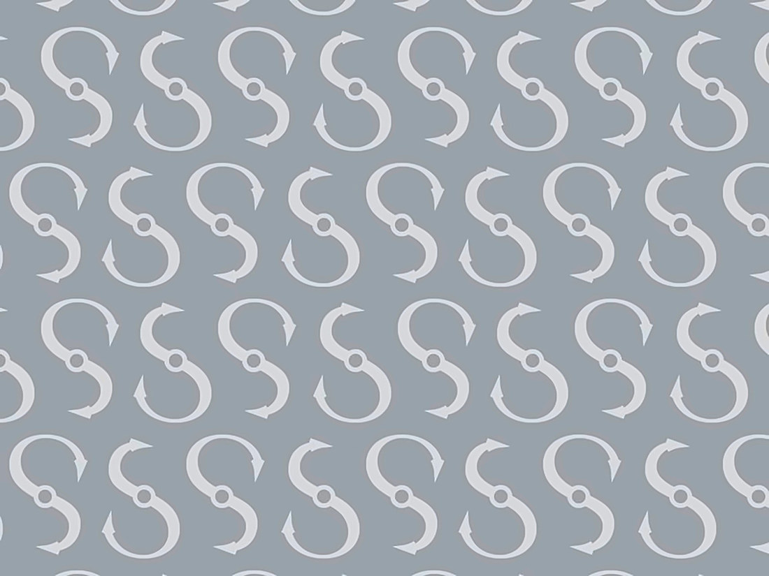
For Select Watches, we created a cleaner and more distinctive identity designed to reflect the brand's focus on quality, trust and carefully selected timepieces. The new symbol brings together the letter S and the visual language of a watch, with details inspired by watch hands introducing a subtle sense of movement.
Services
Rebranding · Creative Direction · Logo Design · Visual Identity · Typography & Color System · Packaging · Retail & Digital Applications
Select Watches
A refined identity for a destination built on precision and timeless style.
A minimalist wordmark and restrained palette of deep navy, silver grey and warm cream give the identity an elegant, contemporary character.
The system was designed to work seamlessly across the physical store, packaging and digital touchpoints, creating a consistent and recognizable presence.
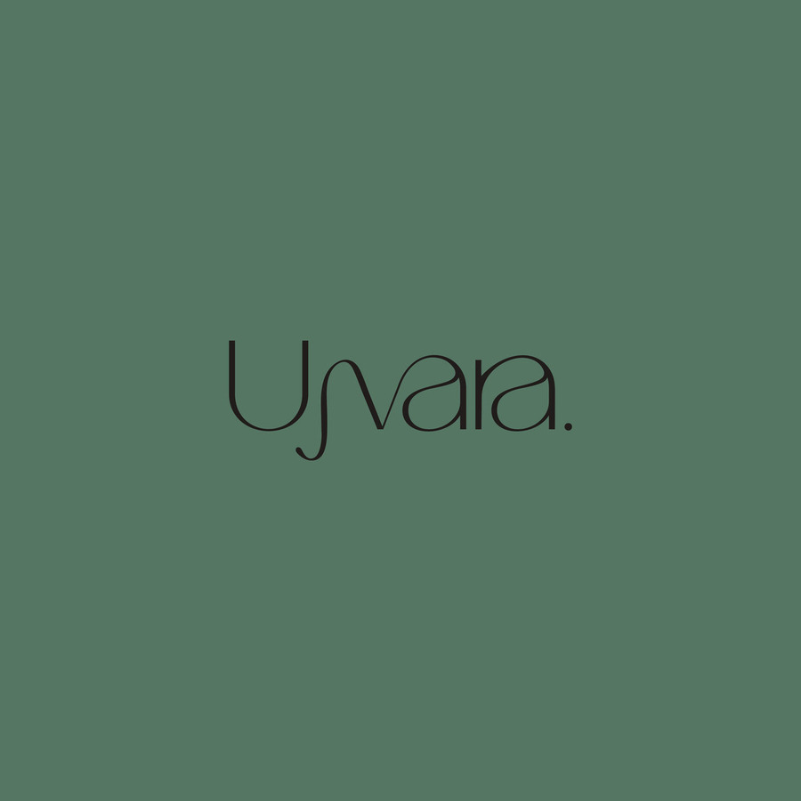
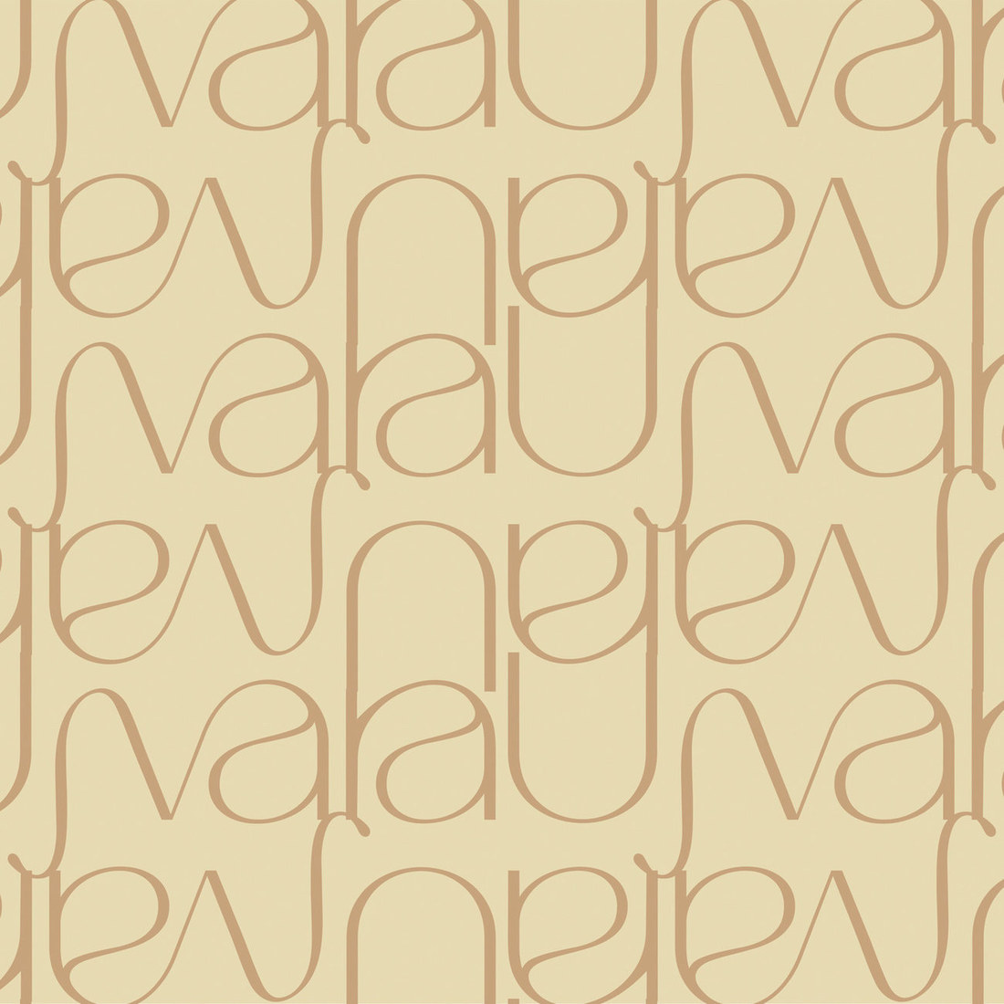
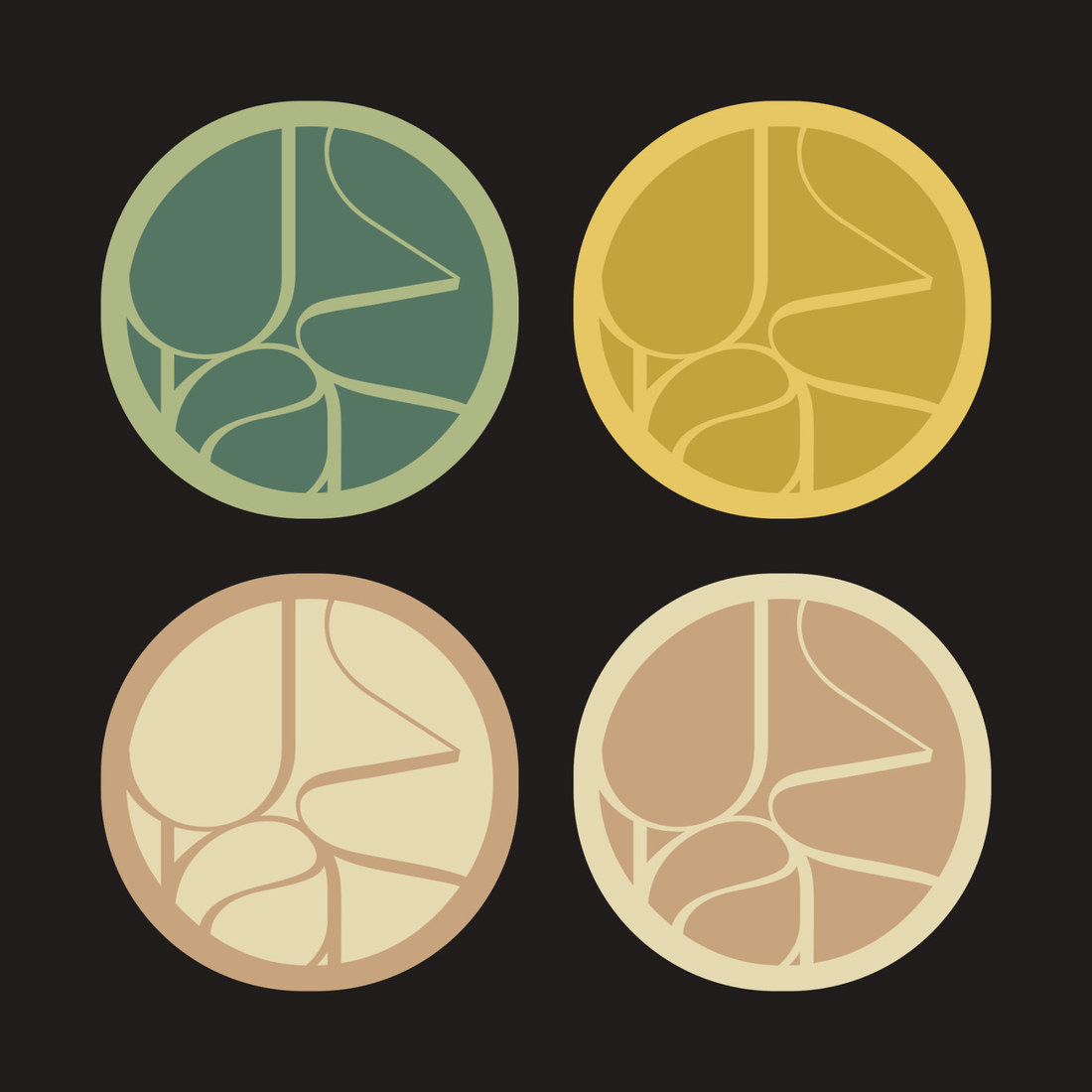
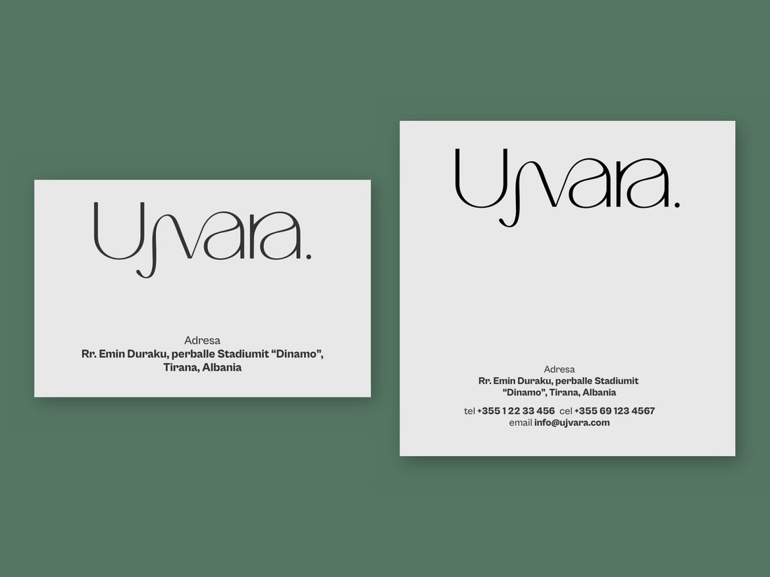
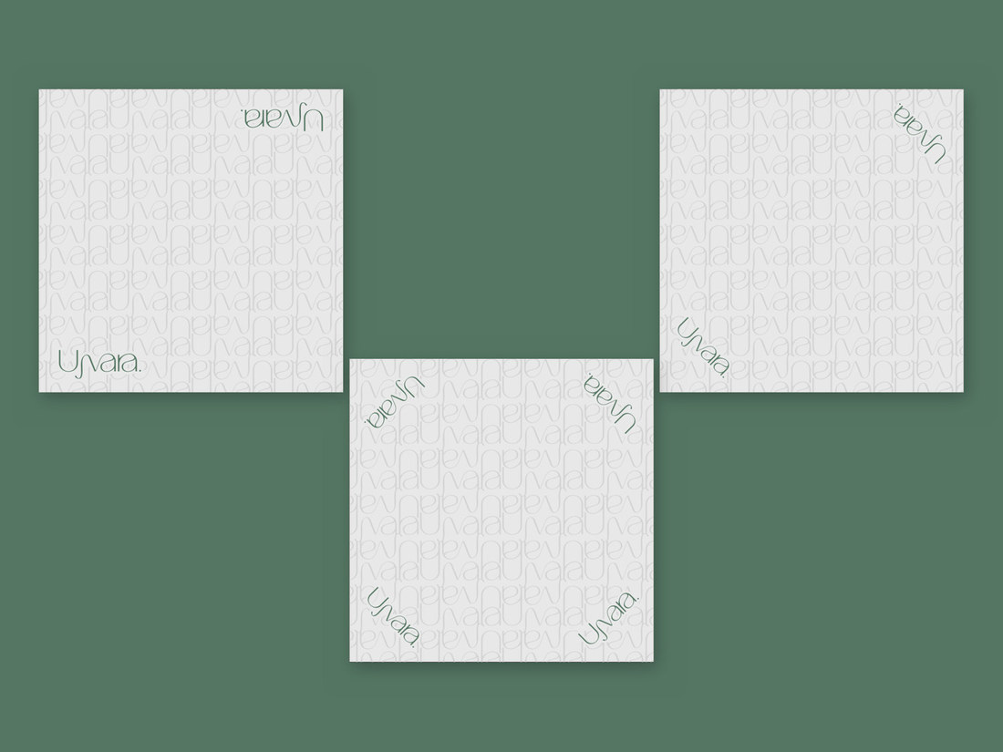
For Ujvara, we developed a refined visual identity around the idea of movement, simplicity and natural flow. The custom wordmark draws from the meaning of Ujvara — Waterfall, translating its fluidity into an elegant, minimal form.
Services
Creative Direction · Logo Design · Brand Identity · Visual System · Typography & Color Palette · Brand Guidelines · Print & Brand Applications
Ujvara
An earthy palette of deep greens, warm neutrals and soft natural tones creates a sophisticated yet organic character.
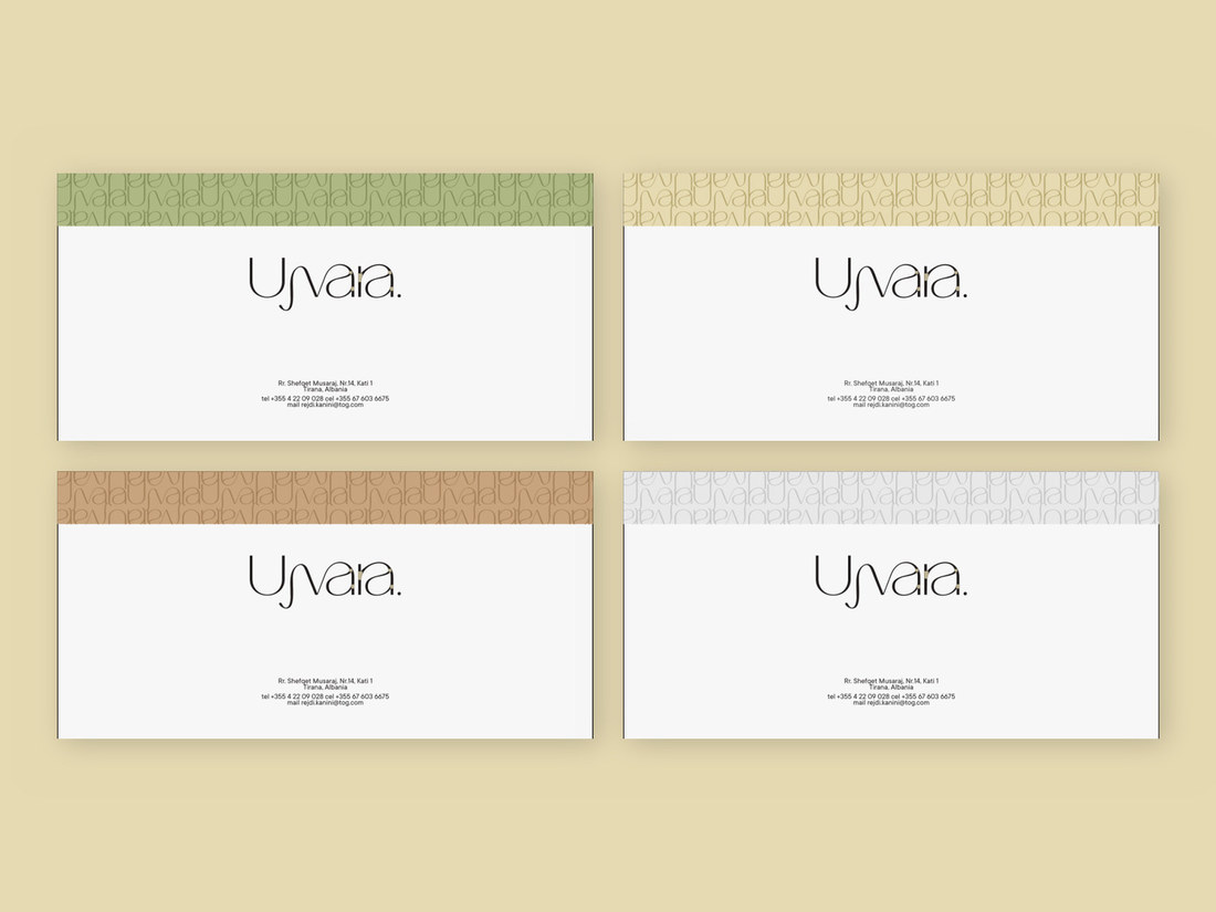
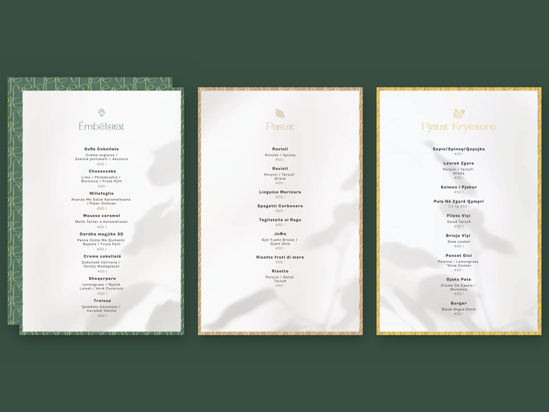
Combined with a clean typographic system and subtle patterns, the identity was designed to feel contemporary while remaining closely connected to the restaurant experience.
The visual system extends across menus, tableware, uniforms, stationery, packaging and digital applications, creating a consistent brand experience throughout every touchpoint.
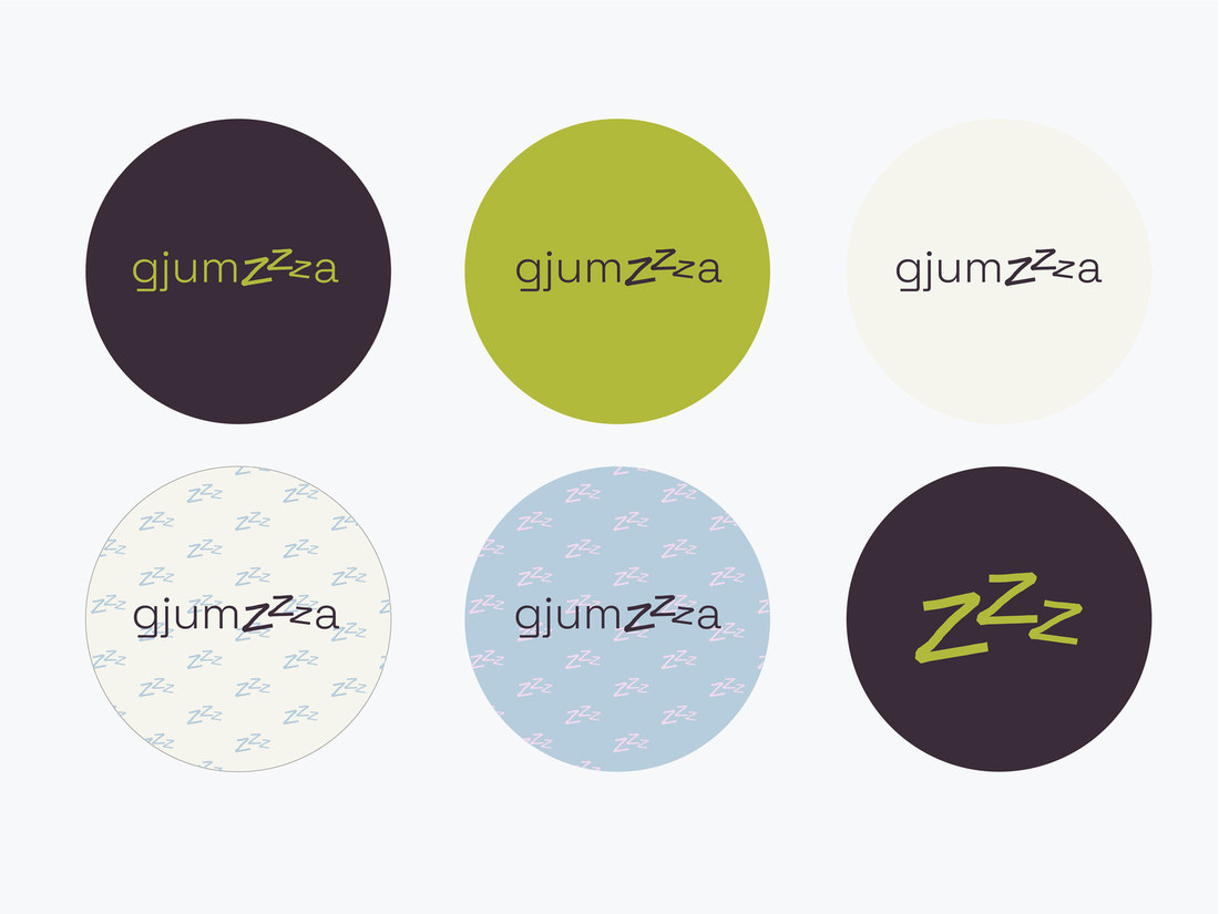
For GJUMZA, we created a warm and contemporary brand identity that turns everyday comfort into a distinctive visual world. The concept is rooted in the feeling of home, slow mornings, cozy moments and the simple pleasure of feeling completely at ease.
Services
Brand Strategy · Creative Direction · Logo Design · Visual Identity · Tone of Voice · Typography & Color System · Brand Guidelines · Packaging · Photography Direction
Gjumza
A playful identity built around the feeling of comfort.
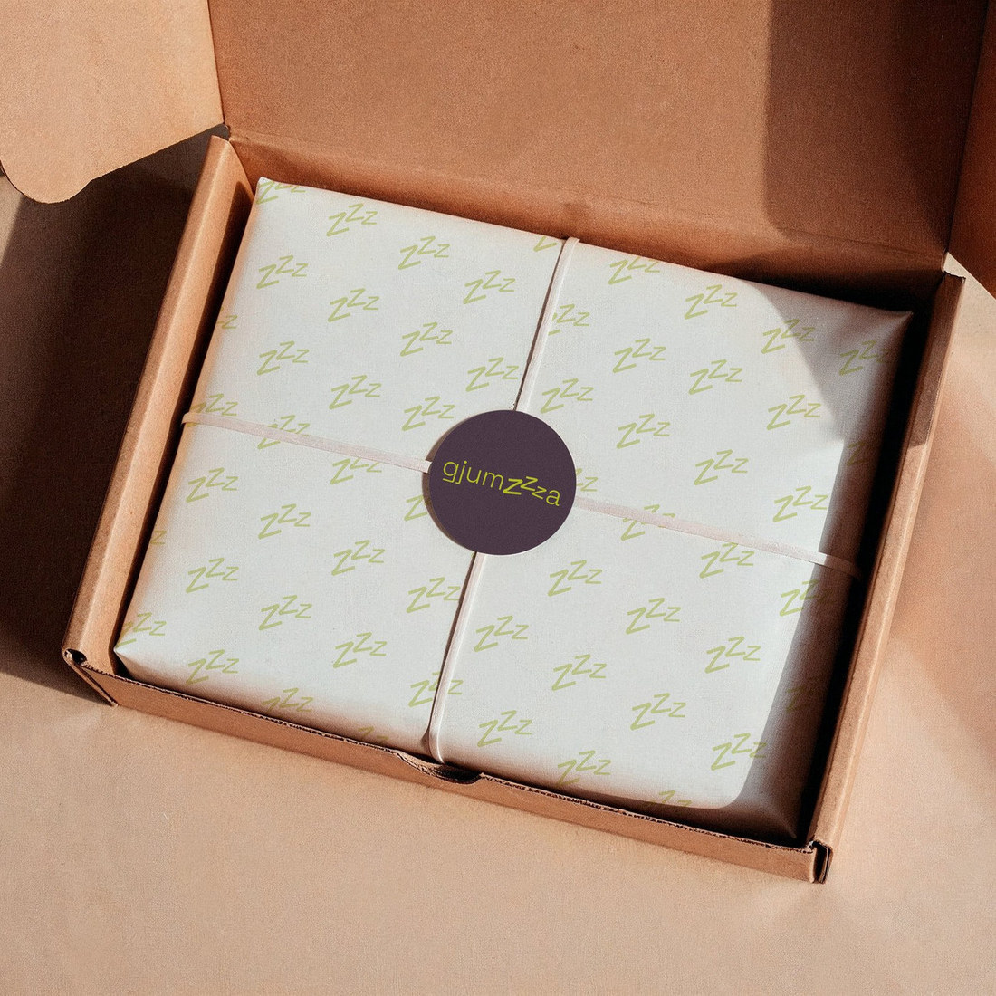
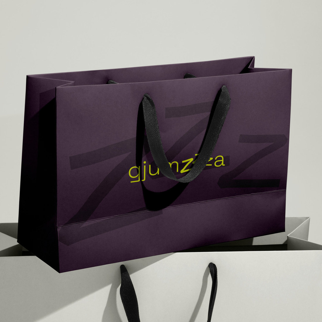
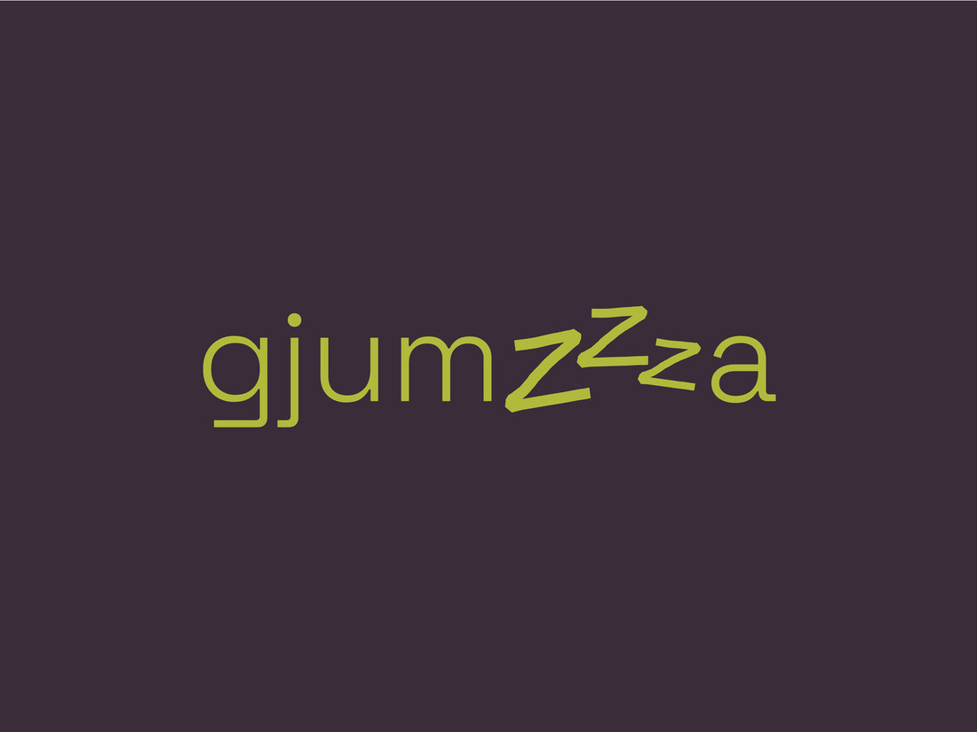
At the heart of the identity is a playful “Zzz” symbol, integrated directly into the custom wordmark and developed into a recognizable graphic element of its own. A bold combination of deep plum and fresh green, balanced with soft neutrals and pastel accents, gives the brand a character that feels both relaxed and confident.
The visual language extends into patterns, hand-drawn icons, packaging and photography direction, creating a cohesive identity designed to feel warm, approachable and memorable across every touchpoint.
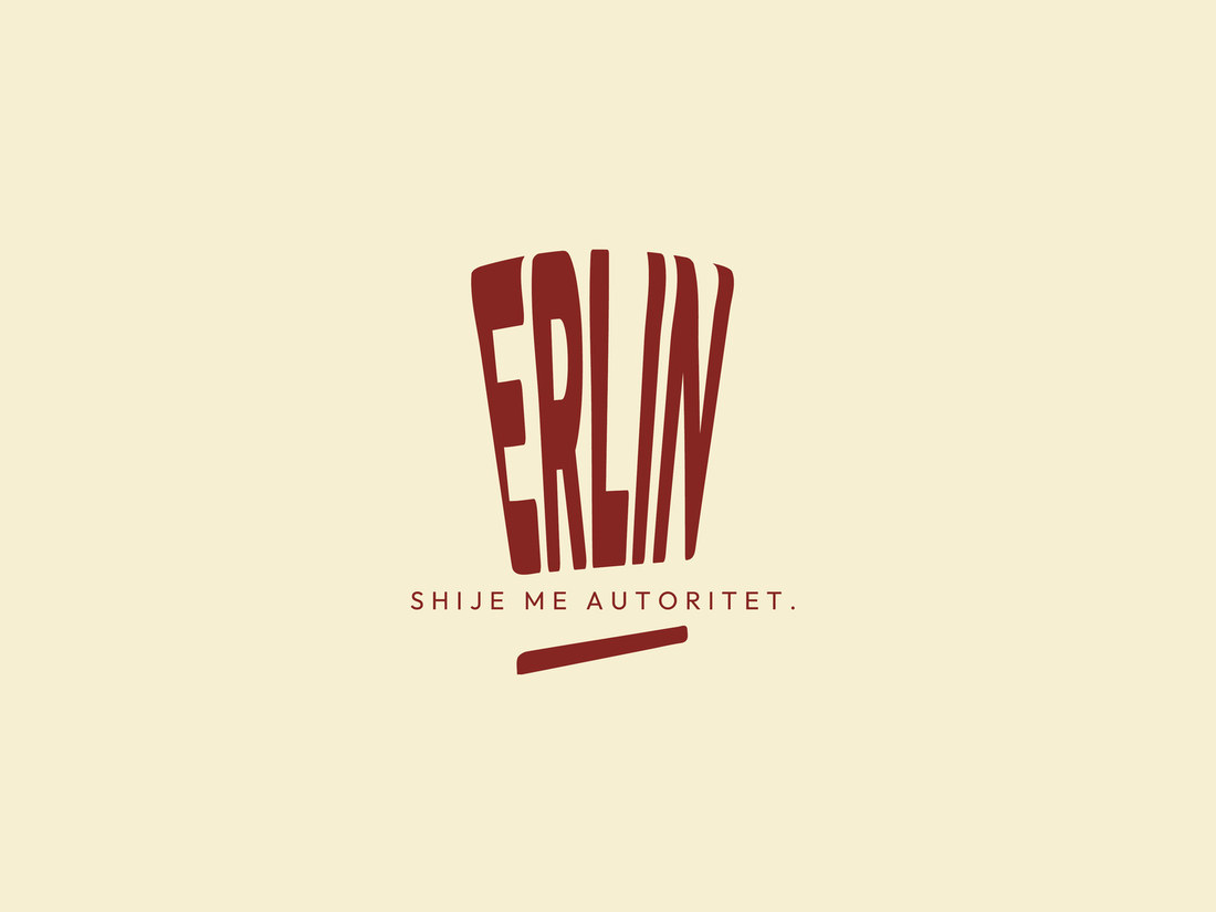
For ERLIN, we created a distinctive visual identity inspired by one of the most recognizable symbols of the culinary world: the chef’s hat. Its form becomes the foundation of the logo, giving the brand an immediate connection to food, craftsmanship and expertise.
Services
Creative Direction · Logo Design · Brand Identity · Visual System · Typography & Color Palette · Packaging · Brand Applications
Erlin
A bold identity shaped by the craft behind the brand.
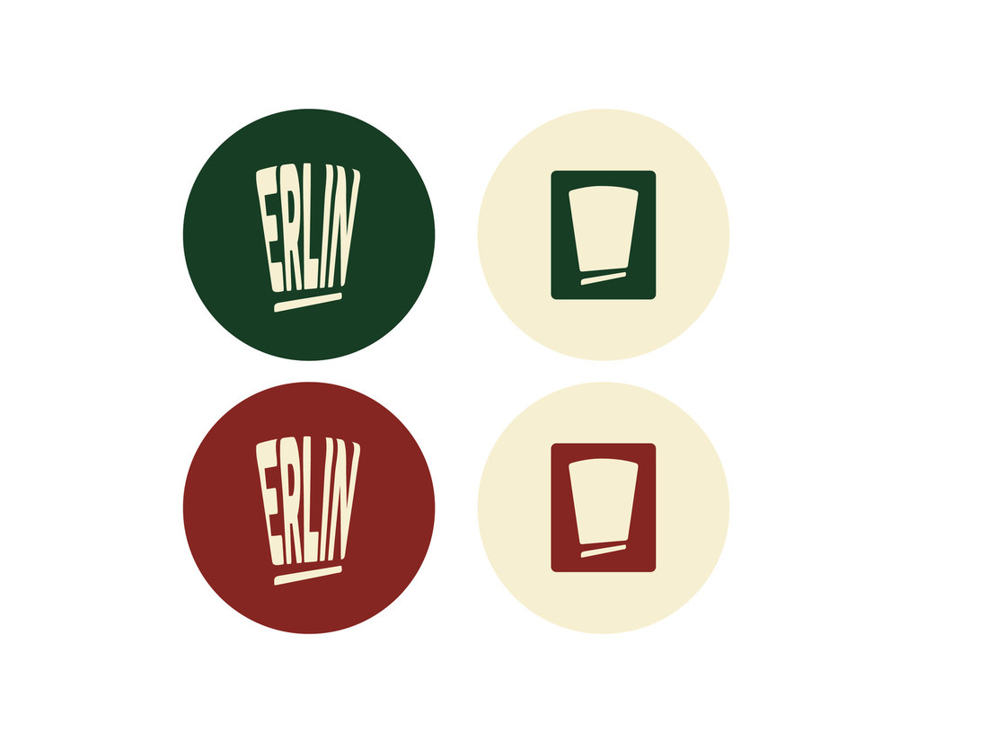
A deep green, warm cream and rich red palette gives the identity a confident yet approachable character, while the expressive typography and graphic system make ERLIN instantly recognizable across different applications.
The identity extends into packaging, stickers, digital applications and a repeatable brand pattern, creating a flexible visual language built around ERLIN’s positioning: “Shije me autoritet.”
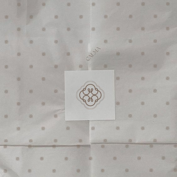
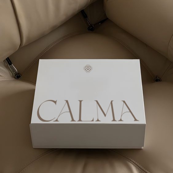
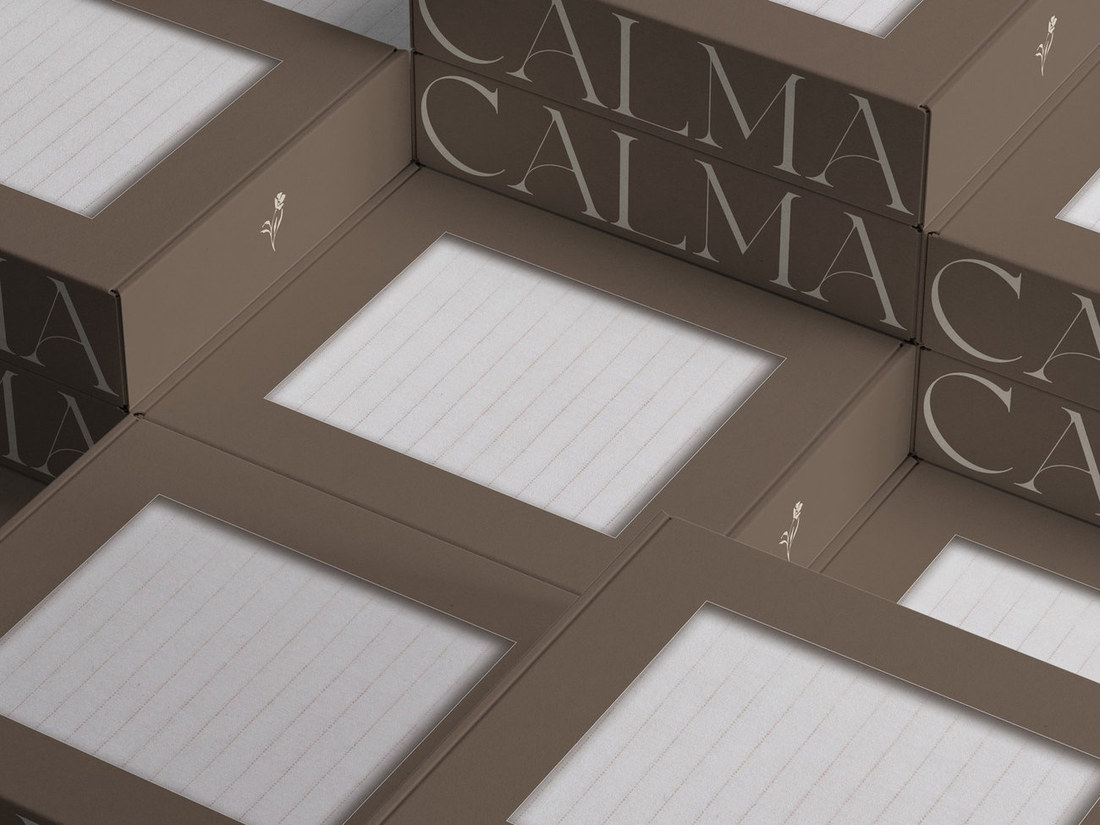
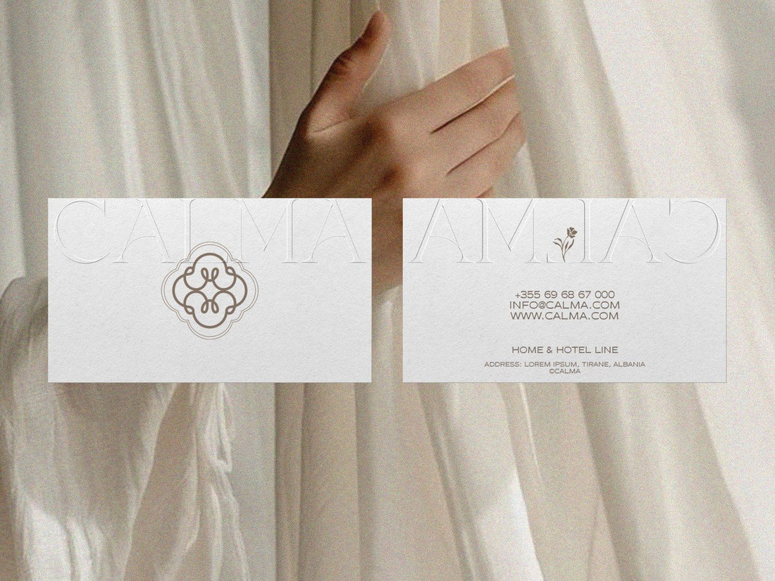
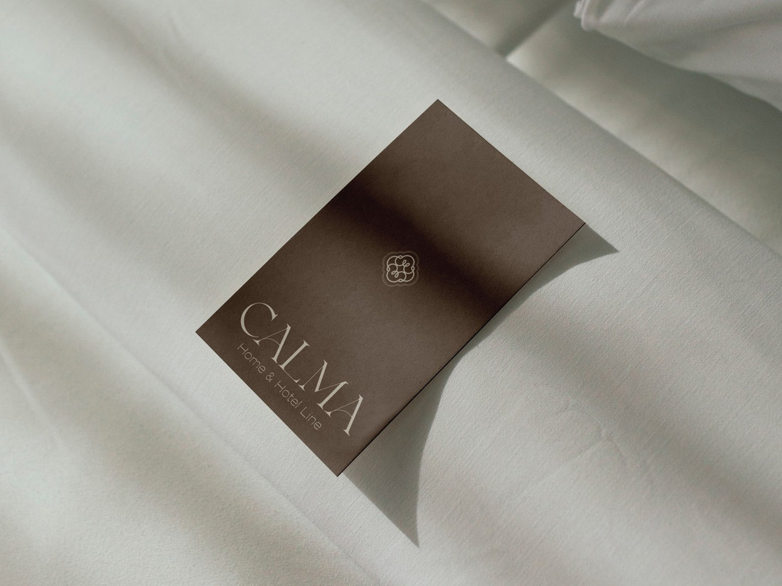
For CALMA, a Home & Hotel Linen brand, we created a refined visual identity inspired by softness, comfort and quiet elegance. The concept translates the tactile nature of linen into a warm, understated visual language designed to feel both contemporary and timeless.
Services
Brand Strategy · Creative Direction · Logo Design · Visual Identity · Typography & Color System · Brand Guidelines · Packaging Design
Calma
A brand identity built around the feeling of calm.
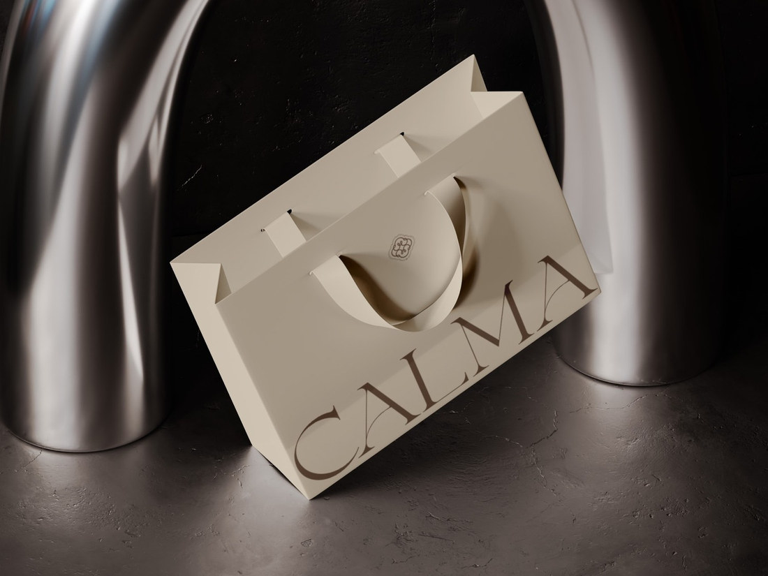
The identity combines a delicate custom symbol with elegant typography and a muted, earthy palette of warm neutrals.
The system was developed to remain consistent across every brand touchpoint, from business cards and textile labels to shopping bags and product packaging.
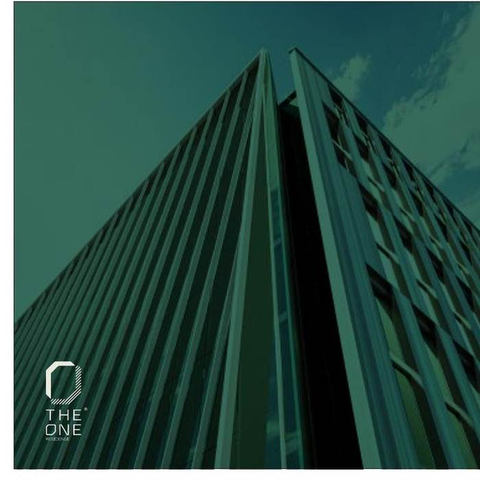
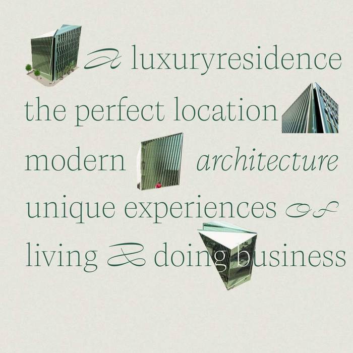
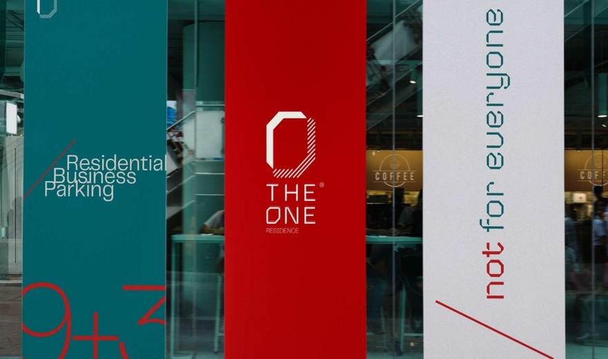
For The One, we built a bold brand identity for a luxury residence and business address in Tirana's Bllok district, where the perfect location meets modern architecture, premium materials and a distinctly elegant character.
Services
Brand Strategy · Creative Direction · Logo Design · Visual Identity · Typography & Color System · Brand Guidelines · Signage · Print & Brand Applications
The One
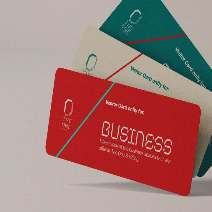
A confident palette of deep teal, gypsum and signal red paired with a bold, architectural wordmark — elegant, simple and impossible to miss.
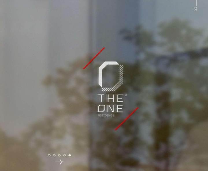
The mark itself takes its form from the building: the letter O reimagined through the facade's vertical and diagonal lines, rendered in a modular, architectural typeface that echoes the tower's bold cuts.
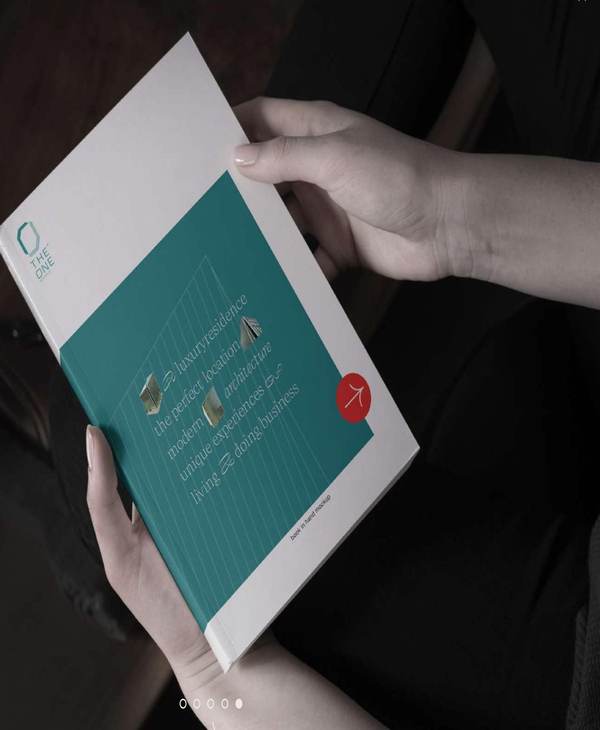
The identity extends across stationery, signage, print materials and digital touchpoints — always paired with the studio's signature line: not for everyone.
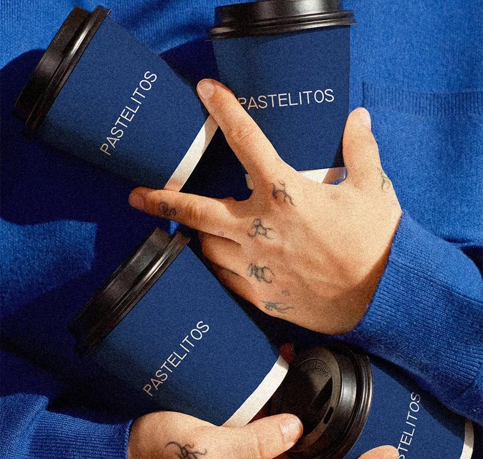
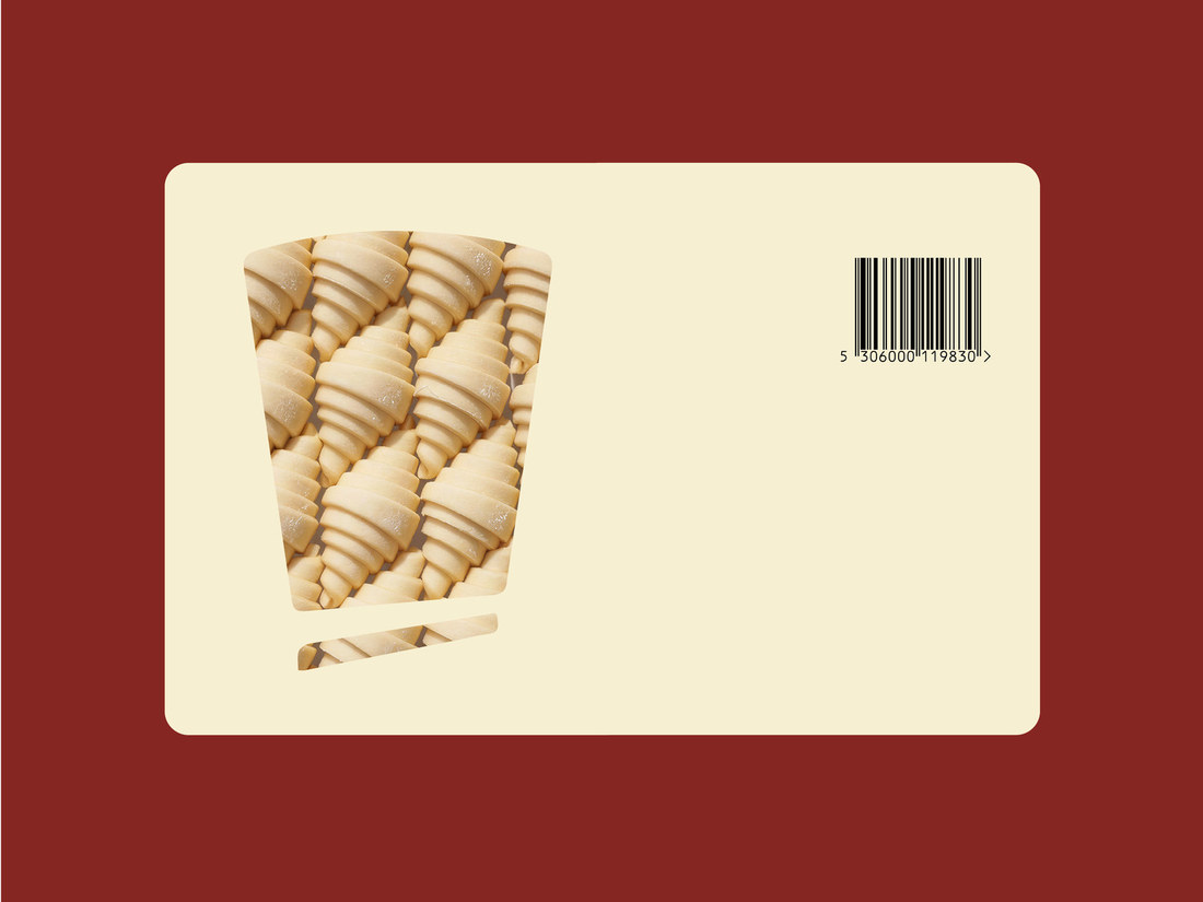
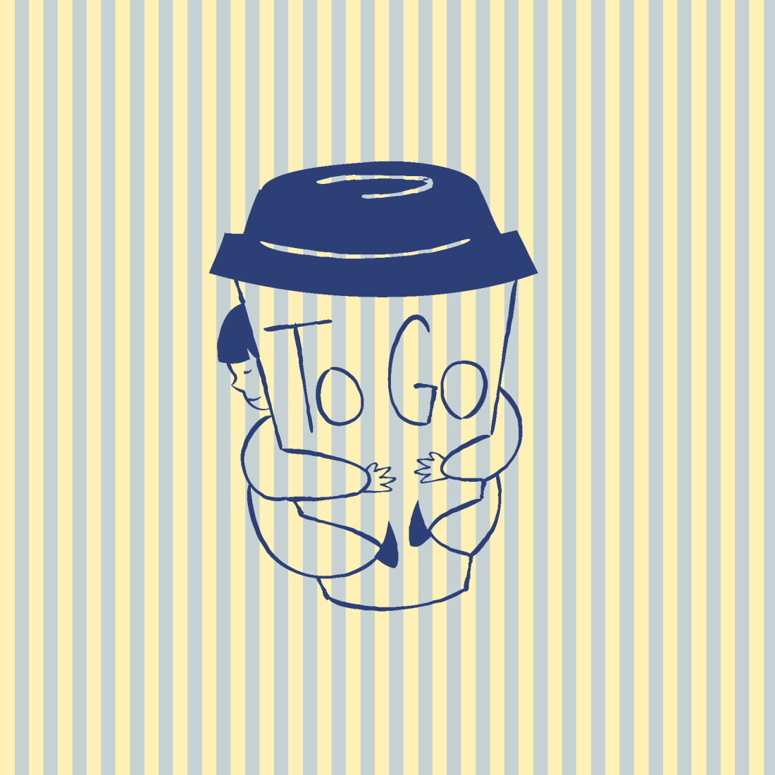
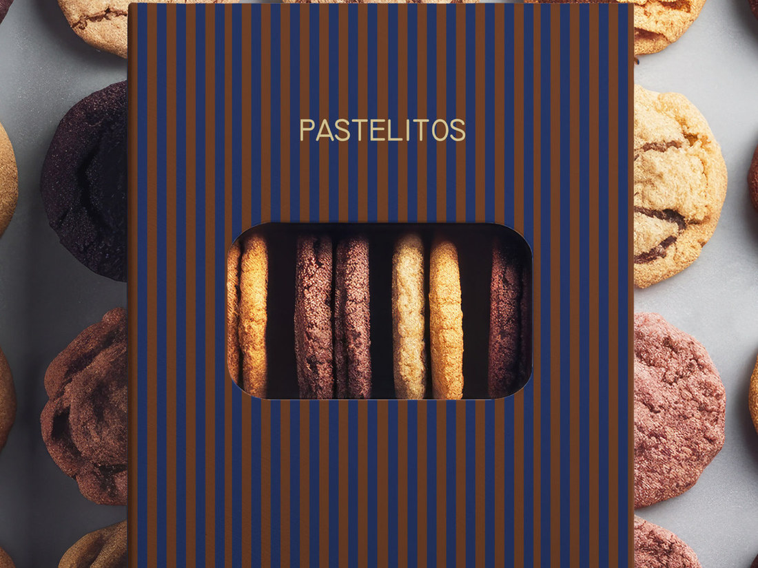
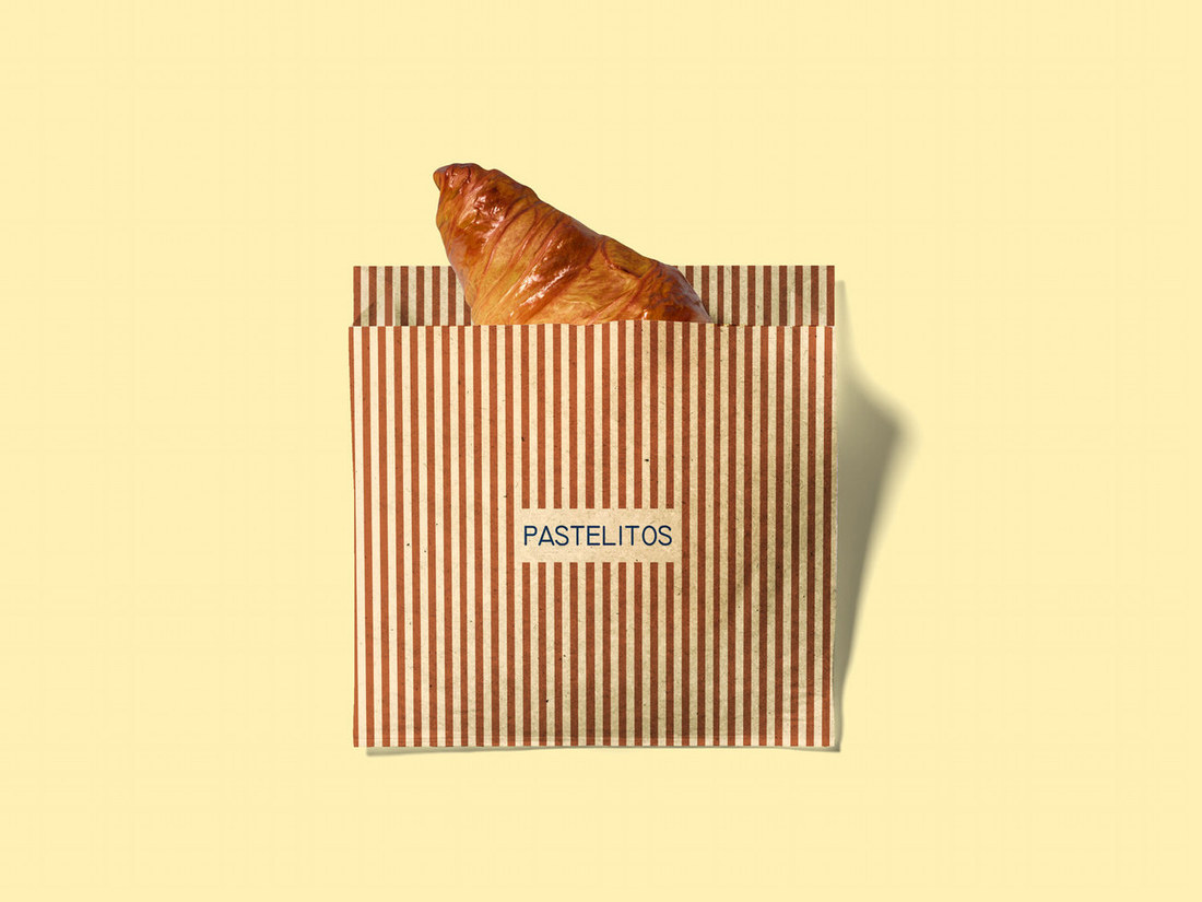
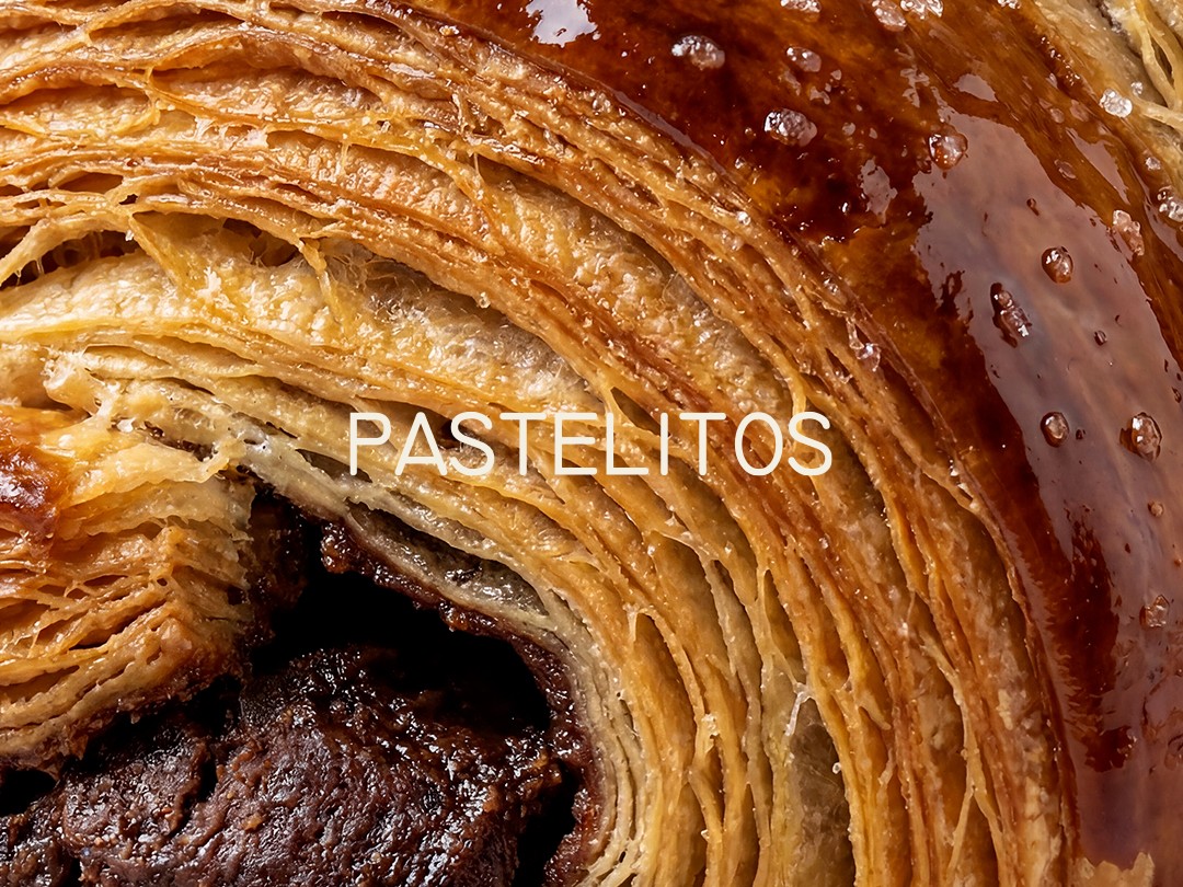
For Pastelitos, we developed a contemporary rebrand built around simplicity, warmth and personality. A clean, characterful wordmark is paired with a distinctive striped visual language, giving the brand an instantly recognizable presence that feels nostalgic and modern at the same time.
Services
Rebranding · Creative Direction · Logo Design · Visual Identity · Color System · Illustration · Packaging Design · Brand Applications
Pastelitos
A fresh identity with a playful take on everyday bakery culture.
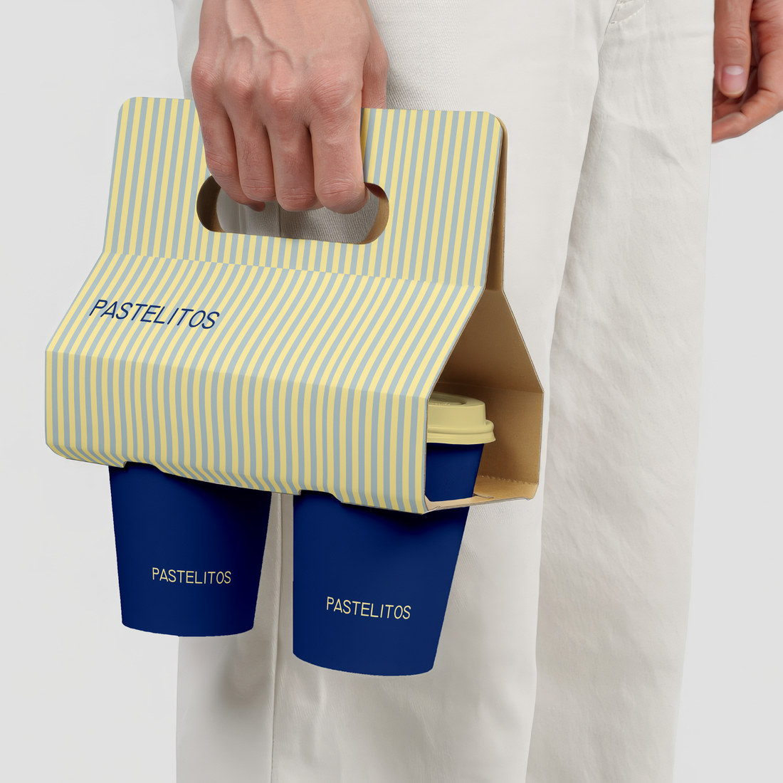
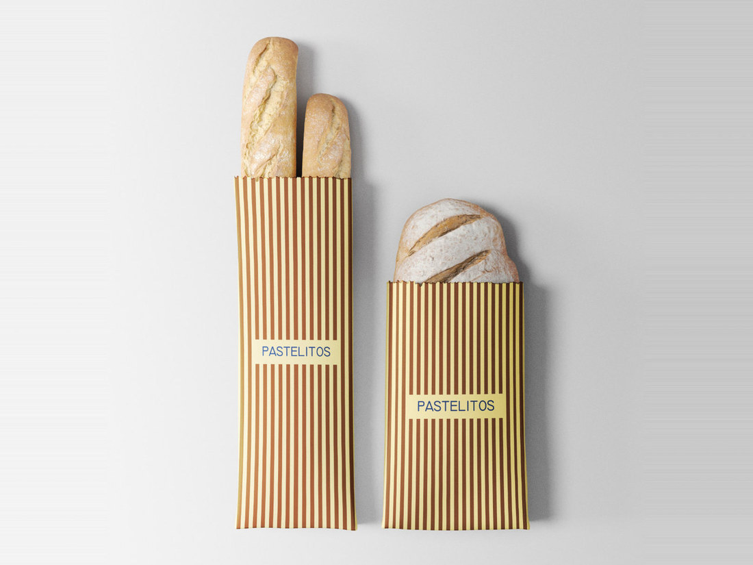
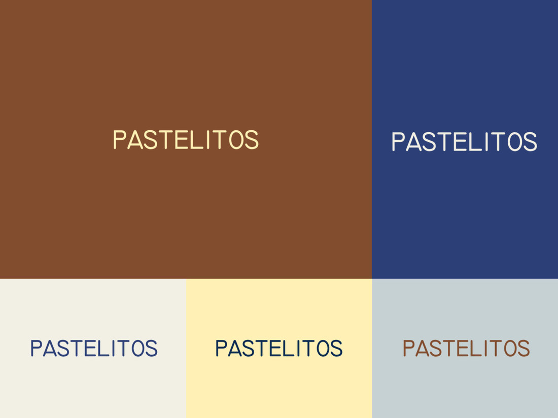
Soft yellow and powder blue meet deeper shades of navy and brown, creating a flexible palette that moves naturally between light, playful moments and richer product-focused applications. Hand-drawn illustrations add another layer of personality, bringing an informal, human feel to the identity.
The system comes to life through takeaway packaging, coffee cups, bread sleeves and pastry boxes, turning simple everyday objects into recognizable Pastelitos brand moments.
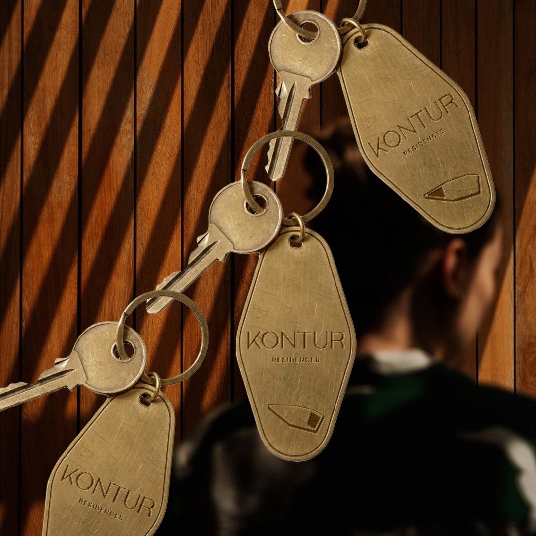
For Kontur Residences, we developed a refined visual identity built around the idea of creating more than residences, creating an address with its own character. The brand is grounded in thoughtful architecture, lasting quality and a vision of contemporary living designed to retain its relevance over time.
Services
Brand Strategy · Creative Direction · Logo Design · Visual Identity · Tone of Voice · Typography & Color System · Brand Guidelines · Brand Applications
Kontur Residences
An identity shaped by architecture, place and a sense of belonging.
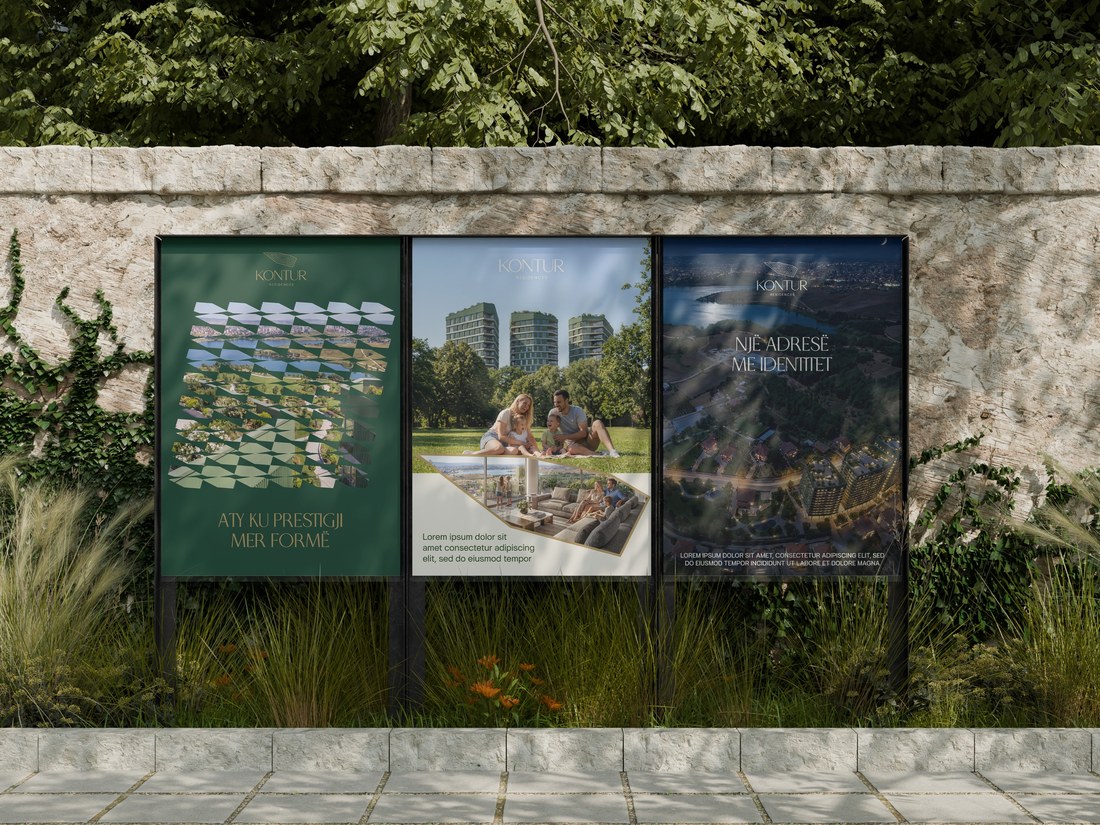
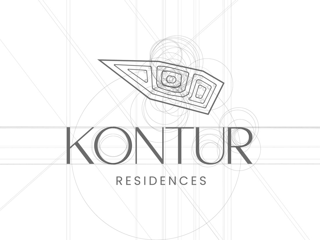
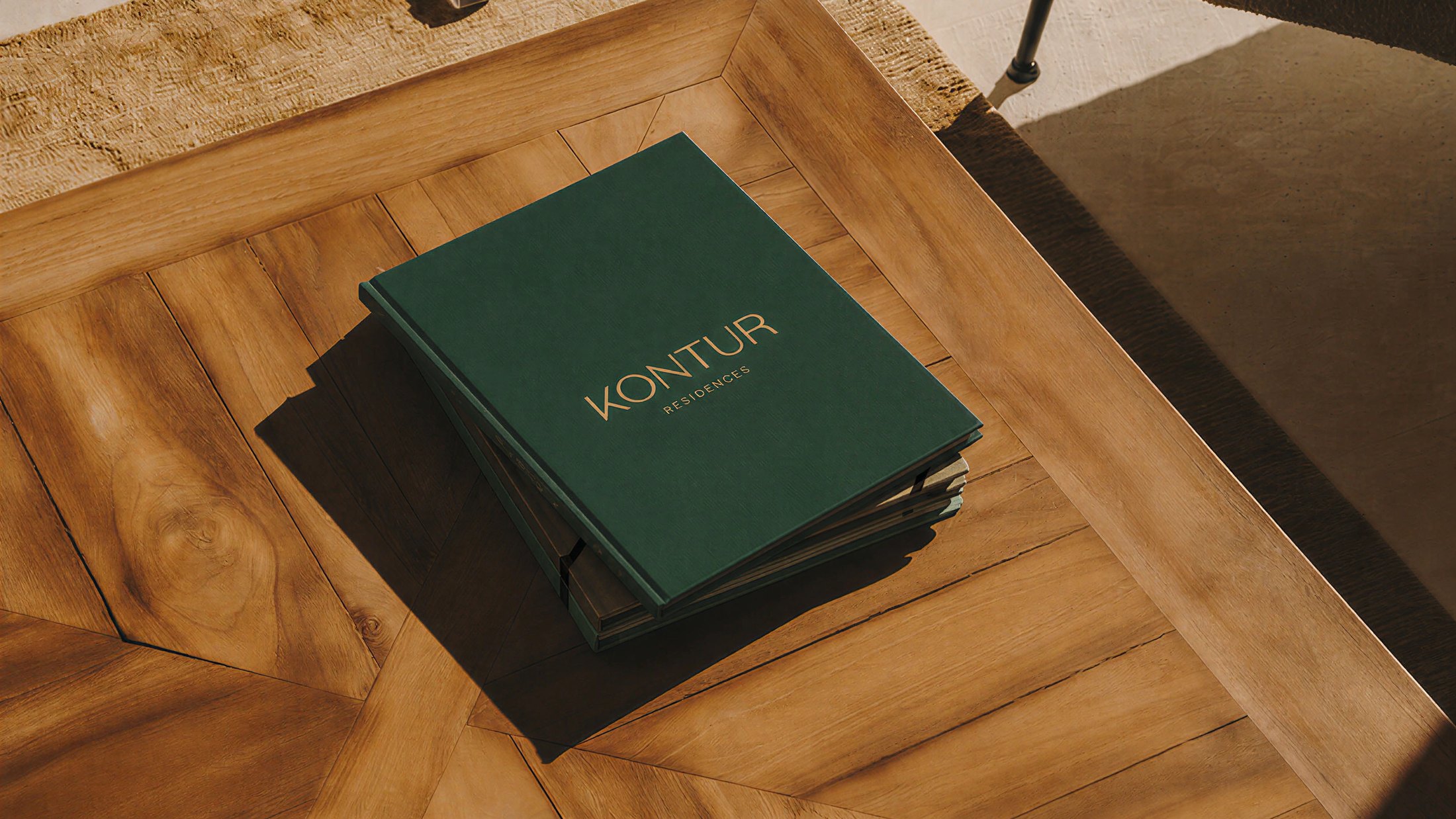
The visual language combines a distinctive architectural logomark with elegant typography and a sophisticated palette of forest green, warm gold and natural linen tones. The result is understated and confident, reflecting the brand’s values of timelessness, precision and refined design.
The identity extends across print, environmental applications and branded assets, creating a cohesive system around the central idea: “Një adresë me identitet.”
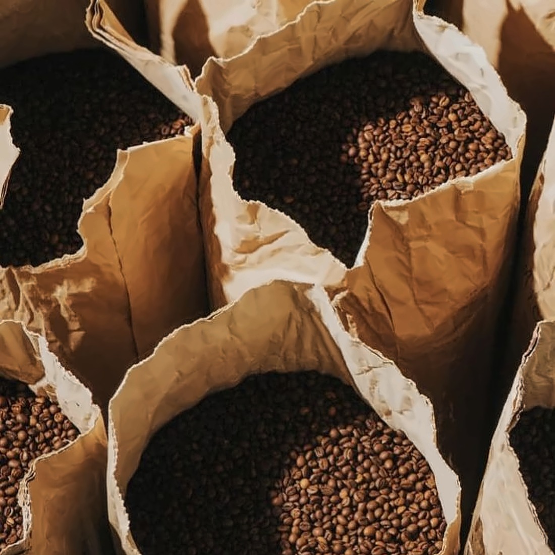
For STIVEN, we created a complete brand identity that brings the heritage of Turkish coffee into a contemporary, refined visual world. The concept is built around warmth, craftsmanship and tradition, positioning STIVEN as a premium brand without losing its authentic roots.
Services
Brand Strategy · Visual Identity · Logo Design · Color & Typography System · Graphic Elements · Brand Guidelines
Stiven Kafe
A timeless identity rooted in the ritual of Turkish coffee.
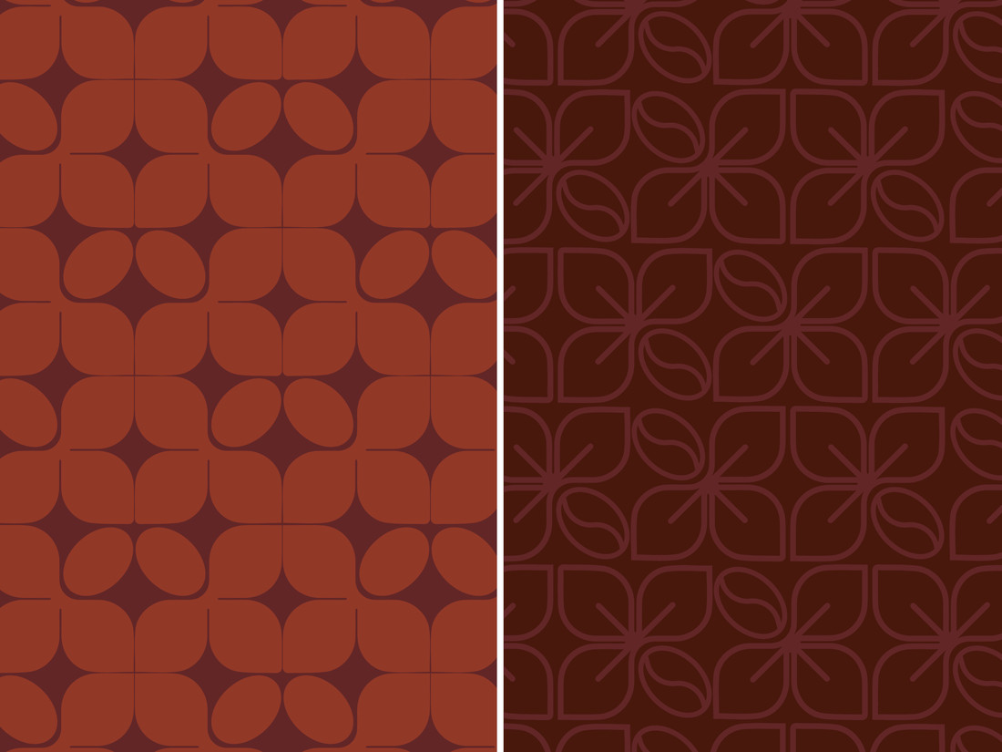
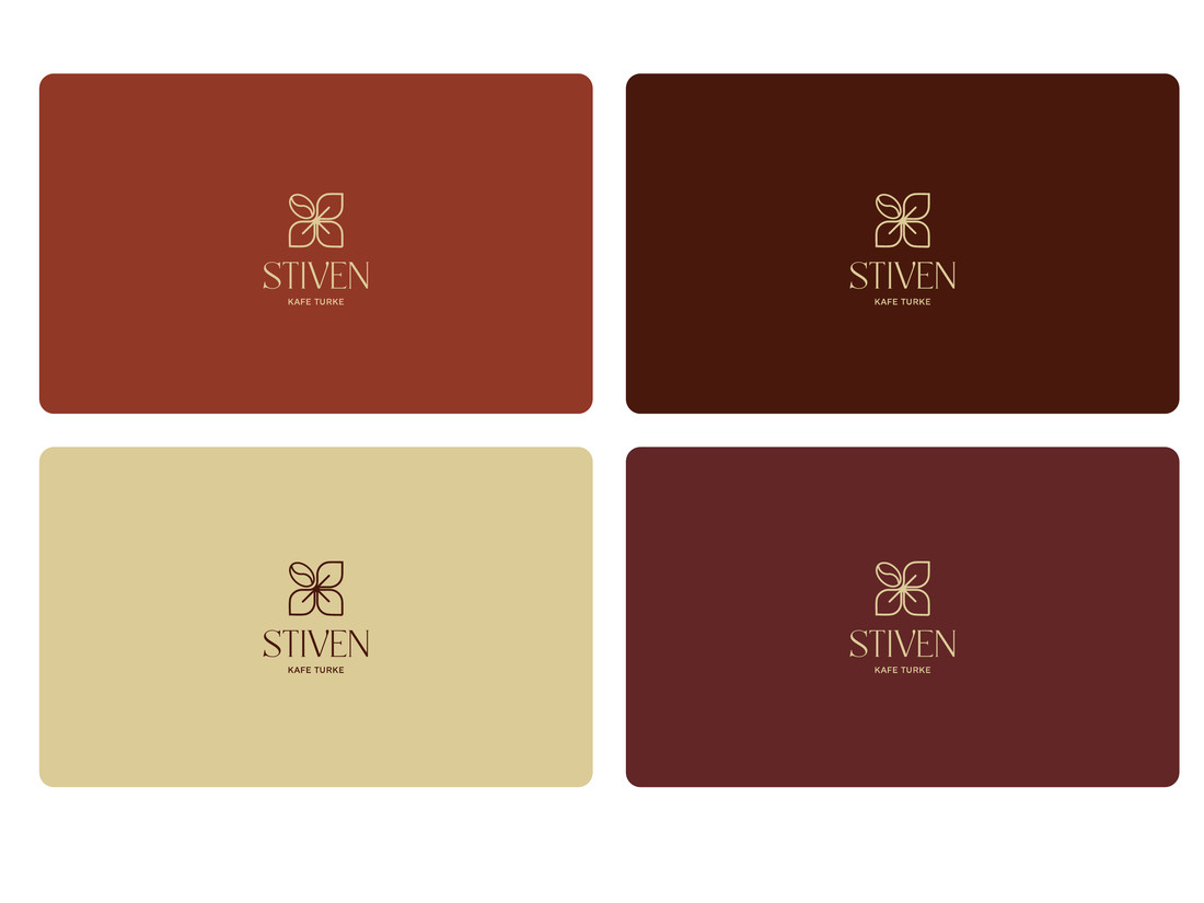
At the heart of the identity is a custom symbol inspired by the geometry of the coffee bean and the delicate form of the coffee flower. The mark becomes a subtle expression of nature, ritual and repetition — designed to feel distinctive yet timeless.
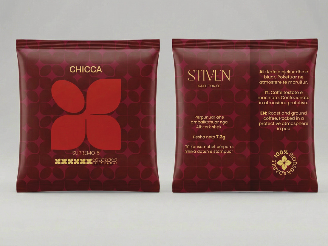
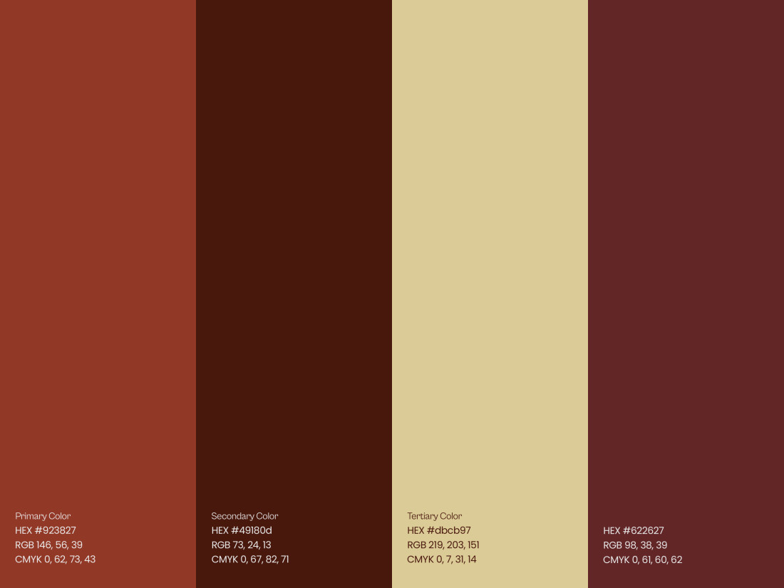
An earthy palette of deep coffee tones, terracotta and warm cream, paired with a clean typographic system and custom graphic patterns, creates a cohesive visual language across packaging, print and digital touchpoints.